

Selected Contents from Portfolio No. 2 (Summer 1950)
Selected Contents from Portfolio No. 2 — Summer 1950
The second issue of Portfolio confirmed the scope of Brodovitch’s experiment.
Conceived and designed by Alexey Brodovitch, Portfolio No. 1 was not a magazine in the conventional sense but an editorial experiment—treating photography, typography, illustration, and sequencing as a single expressive system. Layout was no longer a container, but an active force: rhythm, contrast, and white space became instruments of meaning.
Portfolio No. 2 pushed further into unexplored territory.Page design became a medium of invention in itself, while fine art, graphic experimentation, poetry, and vernacular culture were treated with equal seriousness. The magazine refused hierarchies, allowing visual intelligence to emerge from radically different sources.
Alongside the images, Ikonographia preserves excerpts from the original texts, printed here in italics as primary material. These texts—often reproduced in full—are exceptional in their own right, defining an era and articulating Brodovitch’s vision with a precision and ambition that remain definitive.
The binding hid the architecture of every spread — the alignments, axes, and transitions Brodovitch designed across the full width of the page. The reconstructed full-spread reproductions make those decisions visible for the first time.

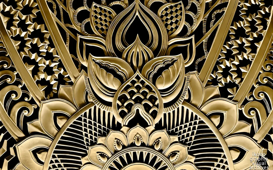
Portfolio Magazine N. 2 Embossed Cover — Summer 1950.
Design for a kite by Charles Eames, reproduced from his original paste-up made with swatches of colored tissue paper.
Page Design as a medium of invention
Rarely is the printed page considered a medium of plastic invention. Its design has become standardized, a machine-like element devoid of feeling and esthetic significance. This is cause for regret, for the variety of forms possible when typography and calligraphy are creatively used approaches that of abstract painting.
On the following six pages, Portfolio reproduces in facsimile a number of unusual pages which possess real visual charm and excitement.
For designers chafing under the conventional discipline of the printed page and seeking new directions, these pages should bring both pleasure and inspiration.

Guillaume Appollinaire. Il Pleu — Page 4-5
Il Pleut, from “Arts et Metier Graphiques,” Paris. France 1930.
The modern French poet Guillaume Apollinaire's sensitive arrangement of his poem "Il Pleut" (It Rains) trickles down through the clean white air of the page opposite like a gentle spring shower.

Two curious pages from an early Christian panegyric — Pages 6-7
Printed in 16th Century Germany and stenciled with mysterious religious symbols—a superb example of that now-extinct form of literary expression known as carmen "figurato” (figured poem).
Portfolio — The Hidden Architecture
Portfolio was bound with staples applied directly through the images. The central area of each double page — axes, alignments, transitions — was permanently obscured, even to contemporary subscribers. In the worst cases, the staples cut through figures, severing compositions that only made sense across the full width of the page.
The reconstruction process separated the pages, digitally realigned each half, and restored the complete spread. What follows is not a reproduction of Portfolio. It is Portfolio as Brodovitch designed it to be read — visible here for the first time.

From Pierre Reverdy's poem Le Chant des Morts (Song of the Dead Ones) — Pages 8-9
A contemporary spread from Pierre Reverdy's poem Le Chant des Morts (Song of the Dead Ones), with the text in the poet's script and illustrated with lithographs by Pablo Picasso, who derived the abstract form of his designs from the skull, the bone and the straight line.

A poem by Wu Chang-Shih — Pages 10-11
A poem by Wu Chang-Shih, one of the greatest modern Chinese calligraphers, written in the calligraphic style known as Ts‘ao-Shu, or “grass” style, because of the impromptu nature of the strokes with which the characters are formed.
Miro on the walls — Wallpapers by Joan Miro and Ilonka Karasz
Miro on the walls — Wallpapers by Joan Miro and Ilonka Karasz.
The word "wallpaper" is no longer a synonym for the musty floral patterns that writhed endlessly on the gas-lit walls of Victorian front parlors. Within the past ten years, a renascence has taken place in the field of interior decoration that is restoring to the design of wallpaper some of the contemporary charm and significance that it possessed as a graphic art in the 18th Century.
Modern masters, such as Matisse, Miro and Calder, have designed wallpapers and printed wall-panels which reflect the spirit of the 20th Century in their imaginative handling of line, color and form. Their work has brought new dignity to wallpaper and given it creative stature among the decorative arts. Simultaneously, new and improved printing methods, such as silk-screen, offset lithography and photo-chemical processes, are permitting the reproduction of various techniques of drawing and painting which could not be approximated a few years ago.
The wallpapers shown here are from Katzenbach and Warren Inc., a contemporary-minded firm which has consistently pioneered modern design in the wallpaper industry.

Miro on the wall — Pages 56-57
The original sketch for a mural design was executed for Katzenbach and Warren Inc. of New York by Joan Miro, famed modern painter, and represents a new concept in wallpaper art.
It was reproduced in the silk-screen process, on a panel measuring four feet high and six feet wide, in a limited edition of 250 copies (price:$350 each).
The artist, who lives in Spain, was sent a catalogue of American pigments to work from; below the original painting he has keyed the six colors he used to their corresponding catalogue numbers.

Wisconsin, wallpaper designed by Ilonka Karasz — Page 61
Wisconsin, an outstanding modern wallpaper designed by Ilonka Karasz and machine-printed by offset lithography for Katzenbach and Warren Inc.
It typifies the fine design and improved reproduction that together are reviving the significance of wallpaper as a decorative art in the United States.
Joseph Low — Design with Linoleum Blocks
Joseph Low, a soft-spoken, pale-faced, 39-year-old artist whose medium is linoleum prints, is well-known to many art directors and magazine editors, although few of them have ever encountered him in the flesh.
Low, who lives a rather hermit-like existence with his wife and two young daughters in a small house deep in rural New Jersey, has impressed the force of his work and personality upon advertising and editorial people almost entirely through the mail. Every two months or so, he mails to a selected list of people a self-promotional little broadside on which is imprinted an example of his work, together with a little message, usually based on an old English nursery rhyme, gently announcing his availability.
Low, who, incidentally, is a superb typographer, sets the type for the message himself and runs off the sheets on his own hand-powered printing press. He initiated the project less than two years ago, after he had resigned from an art instructorship at the University of Indiana and came east to earn his living as a freelance advertising artist.
He quickly found that he was unable to take the emotional punishment that waiting around in advertising agency ante-rooms entailed and he withdrew to the seclusion of his home where he evolved his method of self-promotion by mail.

Joseph Low — Design with Linoleum Blocks & Dampened Paper.
Left: Artist Joseph Low pulling an impression on his hand press. Below: Low inside his rural New Jersey studio-print shop with its old-fashioned stove (bottom), a linoleum block locked up in a printing form, and the finished print. Right page: An enlarged detail from the same linoleum print displays the vigor and fantasy of Low’s engraving style. Photographs by Ed Feingersh. Pages 64-65

Sketches of dogs and mailing pieces — Pages 66-67
Left: Two sketches of dogs, a direct-mail circular, and a page from a brochure on horses, written, engraved, composed and printed by Joseph Low.
Right: One of Joseph Low's quaint self-promotional mailing pieces, based on an old English nursery rhyme, which he recently circularized among his clients.

Joseph Low's Greeting Cards — Pages 66-67
Joseph Low's greeting cards are a delightful blend of whimsy and craftsmanship.
Left: two sketches and a Valentine's Day card. Right: Low's New Year's Day greeting card.
William Steig Illustration
Joseph Low, a soft-spoken, pale-faced, 39-year-old artist whose medium is linoleum prints, is well-known to many art directors and magazine editors, although few of them have ever encountered him in the flesh.
Low, who lives a rather hermit-like existence with his wife and two young daughters in a small house deep in rural New Jersey, has impressed the force of his work and personality upon advertising and editorial people almost entirely through the mail. Every two months or so, he mails to a selected list of people a self-promotional little broadside on which is imprinted an example of his work, together with a little message, usually based on an old English nursery rhyme, gently announcing his availability.
Low, who, incidentally, is a superb typographer, sets the type for the message himself and runs off the sheets on his own hand-powered printing press. He initiated the project less than two years ago, after he had resigned from an art instructorship at the University of Indiana and came east to earn his living as a freelance advertising artist.
He quickly found that he was unable to take the emotional punishment that waiting around in advertising agency ante-rooms entailed and he withdrew to the seclusion of his home where he evolved his method of self-promotion by mail.

William Steig — Arrangements of disembodied heads — Pages 84-85
Haughty woman with her head floating off into space and a man that can't remember where he put his head.

William Steig — Arrangements of disembodied heads — Pages 86-87
Acrobat, Daydreamer, and Carouser. with their heads floating off into space.

William Steig — Arrangements of disembodied heads — Pages 88-89
Sleepwalker, Tough Guy, Huh, Argument — Courtesy, Hatred Page.
Cattlebrands
Cattlebrands are a fascinating form of graphic Americana which have rarely, if ever, been considered from the standpoint of design. They represent a colorful pictorial language in which the American cowboy has expressed himself with characteristic Western pungency and humor.
The practice of branding cattle goes back to ancient Egyptian times, but the first cattlebrand in America belonged to Hernando Cortez, the Spanish Conquistador, who brought a few head of steer and a branding iron to the New World in 1540. His brand was a design of three crosses, representing the Holy Trinity. Many of the cattlebrands reproduced in the following insert have been in use on the Western range for more than one hundred years, and with practice, the greenest tenderfoot can learn to "read" these brands even though he may never get closer to a round-up than a Hopalong Cassidy telecast.
A brand usually consists of a letter, numeral, character or symbol, or a combination of one or any of these elements. Brands are read from left to right. If the characters are placed on top of one another, they are read downward. A letter that is slightly tilted is "tumbling." A letter that is lying down on its side or back is "lazy." A letter that is stretched out and has a curving flare on top is "running." A letter with wings—a dash at the left and a dash at the right on top—is "flying." A letter placed so that the bottom of it touches the inside of a curve is "rocking." Originally, many brands grew out of personal naives. Rancher T. E. Money's brand was the $ sign, Peter Coffin's brand was a P in a pine-box. The famous 6666 brand (Four-Six) in Texas was coined when its owner won his grubstake in a poker game. His winning handheld four sixes. Still other brands were designed from the shapes of everyday objects observed on the range—stirrups, saddles, dippers, guns, the sun and moon, etc., many of them showing a striking use of imagery and symbolism.

Twelve Vintage Cattlebrands — Pages 90-91
DRAG F, O CROSS 0, ROCKING H, SITTING HEART LAY R, PINE TREE, HAT A, ARROW CRESCENT, FLYING WH SWINGING DIAMONDS, HUH CONNECTED, OWL, S SPUR.

Fifty-one vintage Texas cattle brands — Pages 90-91
1, Half Circle Three Circle, 2. T Foot, 3. Spade, 4. 7 Circle L, 5. Fleur De Lis Half Circle, 6. DHP Connected, 7. A Coffin, 8. Bar Button Hook, 9. HTS Connected, 10. Cross A, 11. Double R , 12. H Over: T, 13. Chain 7, 14. Rising Sun, 15. Key No, 16. Mule Head, 17. Curry Comb, 18. Plus Four, 19. Diamond E, 20. Longhorn Plus, 21. Sleeping 6, 22. Pig's Eye, 23. Buzzard on a Rail, 24. Slash Pine 25. Flying JY, 26. Flying B, 27: Snake in Moon, 28. W Bar Cross, 29. Walking Tadpole, 30. Broken Circle Cross, 31. HH Connected, 32. Boot B, 33. Triangle F, 34. Ed Connected, 35. Lazy D J Connected, 36. Double Circle, 37. Two Sixes, 38. Tea Spoon, 39. My Heart, 40. U Fly, 41. H 3, 42. Vertical Double E, 43. Half Circle Q, 44. Running Sac, 45. Drunken T, 46. OK, 47. Cow Head, 48. Diamond H Diamond, 49. Windflower, 50. Crossed U, 51. 03.
Copyright, Links And Credits
Portfolio Graphic Works, Copyright & Credits
© Ikonographia — Digital Restoration & Derivative Work Rights Reserved. These images are part of the Ikonographia Visual Archives: Portfolio Magazine Collection (1950–1951).
⸻
Copyright Status of Portfolio Magazine
Portfolio magazine (Issues 1–3, 1950–1951) was published in the United States and not renewed under U.S. copyright law. It is consequently in the public domain in the United States, and its editorial contents — including design, typography, and reproduced artworks — may be freely used.
⸻
Nature of Ikonographia's Work
The images presented here are not simple reproductions of the original magazine pages. They are reconstructed double-page spreads — a body of work that required the careful unbinding of original copies, precise digitization of individual pages, and their digital reassembly as unified visual fields.
This reconstruction reveals, for the first time, the complete compositions as Brodovitch intended them to be seen — hidden for decades by the tight binding of the original print edition.
Ikonographia's reconstructed spreads are original works and are protected as digital restorations and derivative works. They are available for licensed use through Ikonographia Visual Archives.
⸻
Terms of Use (Summary)
The images presented in this archive are copyrighted and available for licensed use only through Ikonographia Visual Archives.
You may not download, reproduce, publish, or distribute these images without a valid license. For commercial or editorial licensing, please refer to the product pages or contact Ikonographia directly. A full explanation of licensing terms is available in the Shop / Licensing Information section under "Ikonographia — Standard License" and "Ikonographia — Merchandising & Product Use Licenses."
⸻
Ikonographia Mission Statement
Ikonographia is committed to the accurate documentation, preservation, and ethical dissemination of twentieth-century visual culture.
⸻
Archival Notes
These reconstructed spreads were produced as part of Ikonographia's ongoing effort to preserve and make accessible significant works of twentieth-century graphic design.
Original copies of Portfolio were carefully unbound and digitized at high resolution. Individual pages were then reassembled with precision to restore the complete double-page compositions.
All images follow Ikonographia's internal archival standards for resolution, color accuracy, and metadata structure to ensure long-term consistency across the collection.
Ikonographia has made every effort to handle this material with accuracy and respect. We remain available for any inquiry or agreement regarding its use.
⸻
Credits
Portfolio magazine (1950–1951) was created by Frank Zachary and George Rosenthal (editors and co-founders) and Alexey Brodovitch (art director). Their vision produced one of the most significant editorial experiments of the twentieth century.
⸻
Further Reading — Selected Sources
⸻
Explore the Portfolio Archive
-

The Cover of the first number of Brodovitch’s Portfolio Magazine, 1950
€19.00 -

The Colophon of Portfolio Magazine N.1. Design by Brodovitch
€29.00 -
Editorial content on Giambattista Bodoni, Portfolio 1. Design by Brodovitch
€29.00 -
Bodoni’s Numerals and a reprint-as-the-original of Horace’s Opera
€29.00


About Alexey Brodovitch. A short bio.

Brodovitch at work in his studio.
Alexey Brodovitch (1898-1971)
Alexey Brodovitch was a Russian-born American designer, photographer, editor, and teacher whose work fundamentally reshaped twentieth-century visual culture. Best known as the art director of Harper's Bazaar (1934–1958) and the creator of Portfolio magazine, Brodovitch redefined the role of design as an active, expressive force rather than a neutral frame.
After leaving Russia, Brodovitch settled in Paris in 1920, where he absorbed Bauhaus principles, Italian Futurism, and the evolving languages of Cubism, Fauvism, Purism, and Surrealism. This plural exposure forged a visual sensibility grounded in movement, contrast, and disciplined freedom.
In the United States, Brodovitch became both a radical innovator and influential educator, mentoring generations of photographers and designers—including Richard Avedon, Irving Penn, Diane Arbus, and Garry Winogrand—establishing a legacy that continues to define modern editorial design.


, by Anne Fish 1916")


