The City of Opportunity — Art Deco Grilles, Chanin Building, 1929

The City of Opportunity — Art Deco Grilles, Chanin Building, 1929

The City of Opportunity — Art Deco Grilles, Chanin Building, 1929

New York, 1929 — A City at its peak, casting its ambitions in bronze.

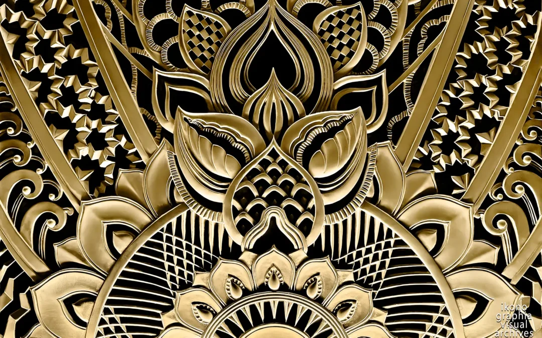
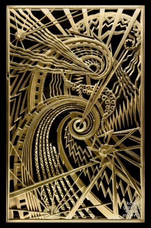
Completed in 1929 at the height of New York’s Jazz Age construction boom, the Chanin Building stands as one of the most intellectually ambitious expressions of American Art Deco. Its façade is admired, its lobby celebrated — but its most fully argued artworks are found in the vestibule: eight monumental gilt-bronze radiator grilles, conceived as a symbolic cycle of human development.

Allegory of Success — Gilded Grille, Chanin Building, New York — 1929 — René Paul Chambellan Success — The reward of sustained action. From "The City of Opportunity — Physical Series." A modern symbolic cycle in bronze. Symmetry returns, crowned with a radiant rising form. Success is rendered not as excess but as order — the balanced resolution of struggle. Spirals unfurl, energy flows upward, and the pattern resolves into harmony. Artist: René Paul Chambellan — Contributor: Jacques Delamarre Photographed by Roberto Bigano. NYC Art Deco Archive, Ikonographia. https://www.ikonographia.com/archive/the-new-york-city-art-deco-archive/

Designed by sculptor Rene Paul Chambellan and executed in collaboration with decorator Jacques Delamarre, these grilles form a complete visual philosophy. The program, titled “The City of Opportunity”, translates the psychological journey of a person’s life into geometric abstraction — a belief deeply rooted in the early 20th century fascination with symbolism, psychology, and the expressive power of line.

Art Deco Allegory of Agitation — gilded bronze grille by René Paul Chambellan, Chanin Building vestibule, New York, 1929.

Agitation.
The first stirrings of consciousness.
From "The City of Opportunity — Mental Series."

Sharp diagonals and restless lines convey the earliest motions of thought — the doubts, the questions, the uncertainty that precedes understanding. It is the unsettling beginning of inner life.
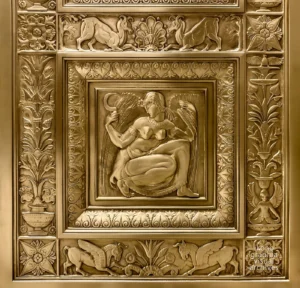
Art Deco Allegory of Vision — gilded bronze grille by René Paul Chambellan, Chanin Building vestibule, New York, 1929.

Vision.
The moment of illumination.
From “The City of Opportunity — Mental Series.”

Here, the composition centers on spiraling curves and backward radiance from the eye — Chambellan’s symbol for introspection. The bowed head of the figure suggests inward concentration, while strong supporting hands denote a gathering of intellectual strength. Vision is not simply sight — it is the birth of clarity.

The Vision Behind the Grilles

Geometry as Thought, Emotion, and Aspiration.

The Chanin program rests on a single conviction: that geometric lines and forms carry emotional meaning as precisely as figurative symbols — if designed with intention. Not decoration. Not ornament. A visual language capable of expressing the inner life of the mind and the outward force of physical action.

The program is divided into two parallel series, mental and physical, each tracing a complete arc of human development. The mental series moves from Agitation — the first, restless stirrings of consciousness — through Vision, Courage, and Achievement. The physical series runs alongside it: Activity, Effort, Endurance, and Success. Together they form a single argument: that the life of the mind and the life of the body are not separate, but two expressions of the same drive.

Each stage is expressed twice — once in a bas-relief figure, once in the grille beneath it. The figure shows a human state. The grille translates it into pure geometry. Spirals, rays, rings, and diagonals carry meanings as specific as words. The two read together as a complete symbolic sentence.

The source is a 1929 article in Architectural Forum, in which Rayne Adams — drawing directly on Jacques Delamarre — explains the program element by element, at the moment of completion. Not interpretation. The artists' own account.

Art Deco Allegory of Courage — gilded bronze grille by René Paul Chambellan, Chanin Building vestibule, New York, 1929.

Courage.
The resolve to act despite resistance.
From "The City of Opportunity — Mental Series."

In this panel, Chambellan visualizes determination as flowing arcs and tightly woven diagonals. The struggle is present, but so is forward momentum. Obstacles appear as counter-lines, yet purpose pushes through them. It is the geometry of bravery.

Art Deco Allegory of Achievement — gilded bronze grille by René Paul Chambellan, Chanin Building vestibule, New York, 1929.

Achievement.
The fruition of thought.
From "The City of Opportunity — Mental Series."

A rising sun, concentric spirals, and balanced symmetry mark the culmination of mental effort. The pattern is no longer restless but ordered, luminous, and harmonious. Achievement is not finality, but the moment when intention becomes reality.

The Artists Behind the Vision

Rene Paul Chambellan — Sculptor of the American Skyline.
Trained in low-relief technique, Chambellan brought to the Chanin commission a sculptor's understanding of how geometric line carries weight and movement — how a spiral tightens under pressure, how a diagonal conveys force. The nickel-silver elevator doors at 70 Pine Street and the Atlas modeling at Rockefeller Center place him among the defining contributors to New York Art Deco metalwork. The Chanin grilles are his most sustained intellectual work: a symbolic cycle that translates human psychology into architectural geometry.

Jacques Delamarre — The Program's Architect.
Delamarre's role was conceptual. Where Chambellan gave the grilles their sculptural form, Delamarre constructed the narrative — the two-series structure, the sequence from Agitation to Success, the decision to run mental and physical development as parallel arguments. The Architectural Forum article that survives as the primary document of the Chanin cycle is, in effect, Delamarre's account of his own design thinking.

Together they produced something with no direct equivalent in New York Deco: a complete symbolic program in which every geometric element carries a specific, intended meaning.

Art Deco Allegory of Activity — gilded bronze grille by René Paul Chambellan, Chanin Building vestibule, New York, 1929.

Activity.
The beginning of physical exertion. From "The City of Opportunity — Physical Series."

Interlocking rays and rising diagonals give this panel a kinetic rhythm — the first outward expression of purpose in the world. It is the geometry of initiation, the body waking into movement.

Art Deco Allegory of Effort — gilded bronze grille by René Paul Chambellan, Chanin Building vestibule, New York, 1929.

Effort.
The struggle against resistance.
From "The City of Opportunity — Physical Series."

Here, spirals tighten, diagonals collide, and curves appear compressed, as if bearing weight. The composition visualizes the tension between aspiration and the obstacles that define it. Effort is the architecture of perseverance.

Beyond Symbolism — The Human Story in Bronze

Viewed as a whole, the Chanin grilles offer something rare in architectural sculpture: a complete narrative of human development told through pure form. Geometry carries emotion. Abstraction carries argument. Eight panels, two sequences, one program — conceived in 1929 and still precise.

Nearly a century later, the panels hold their strange mixture of optimism and introspection — a Jazz Age faith in progress captured in metal. Chambellan's question was not rhetorical. It is there in every rising line, every spiraling curve, every radiant burst: what does it mean to strive? The eight grilles are the answer.

Art Deco Allegory of Endurance — gilded bronze grille by René Paul Chambellan, Chanin Building vestibule, New York, 1929.

Endurance.
The steady continuation of labor.
From "The City of Opportunity — Physical Series."

This grille stands tall and monumental — a symbolic skyscraper of human resilience. Vertical lines run uninterrupted through the panel, marking the steady, disciplined continuation of work. Its strength lies in repetition, in the refusal to break.

bule, New York, 1929.

Success.
The reward of sustained action.
From "The City of Opportunity — Physical Series."

Symmetry returns, crowned with a radiant rising form. Success is rendered not as excess but as order — the balanced resolution of struggle. Spirals unfurl, energy flows upward, and the pattern resolves into harmony.

The Chanin Building Symbolic Program

Eight Grilles, Eight Bas-Reliefs — A Dual Expression of Human Development

For decades, the Chanin grilles were admired but not understood. Visitors saw geometric patterns in bronze, felt their visual power, but couldn't decode their meaning. The symbolic program remained partially locked.

The key appeared in May 1929, just months after the building opened: a six-page article in The Architectural Forum written by Rayne Adams, featuring direct explanation from Jacques Delamarre—the collaborator who conceived the narrative structure with Chambellan.

This wasn't later interpretation. It was the artists explaining their own work at the moment of completion.

For Ikonographia's research, this text functioned as a Rosetta Stone: it allowed the grilles to be read as their creators intended, aligning what we see in the bronze with what Delamarre and Chambellan meant to express.

Vision bas-relief by René Paul Chambellan, Chanin Building vestibule, New York, 1929.

Vision Bas-relief.
The moment of illumination.
From "The City of Opportunity — Mental Series."

Excerpts From "Architectural Forum", May 1929 — Primary Source: Jacques Delamarre

The entire article is included in the downloadable document. What follows are the passages that most directly illuminate the symbolic program.


The Philosophical Foundation: Geometry as Emotional Language

Why geometric abstraction? Why not traditional allegory?

Rayne Adams begins by defending the decision to use pure geometric forms rather than conventional symbolism:

"Most designs are conceived and executed with little thought... The common run of decorative design follows along no intellectual line of effort which is in any way exacting. If we have to portray winter, we picture it as 'a weak old king who feels, like Lear, upon his withered face, Cordelia's tears.' And all select a bluebird as a symbol for happiness."

This conventional symbolism, Adams argues, is "labored" and "lacks subtlety." But there's another path:

"The dominant idea which they have sought to set forth is the significance of geometric lines and their capacity to symbolize emotions and abstractions of thought and deed... A consensus of opinion has established certain characteristics which are associated with types of line and of form. For vexation or perplexity we all scribble a confused scrawl; the flowing curve suggests ease and grace; the circle suggests completeness."

This is the conceptual core: geometric forms can carry emotional meaning just as powerfully as figurative symbols—if designed with intention.


The Structure: Two Parallel Series

Each grille corresponds to a stage of human development, divided into mental and physical progression:

"In these reliefs and grilles they have envisaged this life under two commonly accepted categories,—that which sets forth the physical life and that which sets forth the mental life."

"Certain phases of development under each category are presented by a panel figure in relief supplemented by a grille design placed immediately beneath."

The Mental Series (consciousness developing):

  1. Agitation — "the first conscious stirrings; the first doubts, the first questions and uncertainties"
  2. Vision — "the birth of conscious planning and the formation of a definite and compelling ideal"
  3. Courage — "the man at work,—following out, with firm resolution and steady purpose, those ideals which are his, beset by obstructions, yet achieving"
  4. Achievement — "the fulfillment of his work"

The Physical Series (action manifesting):

  • Activity, Effort and Endurance, and Success — "exemplifies in its way the characteristics presented by the series showing the mental development"

How to Read the Grilles: The Case of Vision

Adams provides a detailed reading of one grille to show how the geometric language works:

"In the relief, showing a crouching figure, we see the vacant look,—'the light drawn backwards from the eye'—betokening introspection and concentration; the bowed head characteristic of the thinker, and the supporting hands,—that gesture which has always something pathetic about it—as though the strong hands of the body were giving support to the troubled mind."

The corresponding grille translates this into pure geometry:

"The mental world of this thinker is symbolically represented by the spiral convolutions, expanding in wider and wider sweeps, while his inspirations or impulses for action are marked by the indented, radial lines."

"The deepest indentation marks the definitive and determining inspiration under the aegis of which he will, for good or ill, follow through his life to some significant end."

"The grille design supplementary to this relief bears out this thought. The dominant inspiration is represented by the continuous ray, which, passing through the barriers of doubt and ignorance, pursues its unbroken way. Other inspirations, other compulsions, are represented by the non-continuous rays; these are less perfect. The tangent rings of successively increasing diameter represent the successive phases of his life."

This is how the system works: each geometric element—spirals, rays, rings, indentations—carries specific symbolic meaning, allowing complex psychological states to be expressed through abstract pattern.


The Grilles and Reliefs as Unified Language

Critically, the grilles are not decoration—they are translation:

"The supplementary grille panels, wholly geometric in conception, present a symbolism which, interpreted, bears out the meaning of the corresponding relief figures."

The bas-relief shows a human figure embodying an emotional state. The grille beneath translates that same state into geometric abstraction. Together, they form a complete symbolic language: one figurative, one abstract, both expressing the same idea.


Adams' Final Assessment

Despite the intellectual complexity of the program, Adams judges the work on aesthetic grounds:

"Whether the union has brought forth progeny whose aesthetic quality will stand, is something for the critics to decide. As an expression of a method of achievement, the work may be characterized assuredly as not lacking in the spirit of adventure."

"For my own part, I confess that I have rarely looked upon relief figures which have struck me as more worthy of praise than these. To say that they are masterly is not enough; they hold, for those of us who care for abstractions, what is far more important,—something of genius."


Primary Source Document

The complete 1929 article by Rayne Adams is available as an attached document for researchers who wish to read the full philosophical argument and additional symbolic details.

[Download: "The Reliefs and Grilles of the Chanin Building Vestibules" – Architectural Forum, May 1929]


What this text provides:

A contemporary explanation of the grilles by their creators, allowing Ikonographia's photographic documentation to be read with the precision the artists intended—not through later guesswork, but through direct alignment between visual evidence and original meaning.

Architectural Forum, May 1929 — Chanin Building reliefs and grilles by René Paul Chambellan, with Jacques Delamarre as collaborator.

Architectural Forum, May 1929

Contemporary publication illustrating René Chambellan’s reliefs and grilles for the Chanin Building, New York.
Here the symbolic program of the vestibule bas-reliefs and grilles is explained directly by Jacques Delamarre, the collaborator responsible for articulating their narrative structure.
It is a sort of "Rosetta Stone" to decipher the complex project of "The City of Opportunity,”

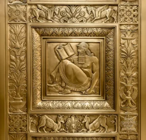
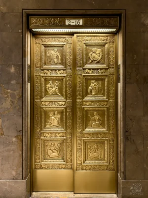
CODA — Seventy Pine Street: A Related Masterwork

Another remarkable Chambellan work— The "Evolution of Fuel" Elevator Doors

Though separate from the Chanin cycle, the nickel-silver Evolution of Fuel elevator doors at 70 Pine Street deserve their own reading — created for the Cities Service Oil Company.

Chambellan was a master at exploring new metal alloys. Here he worked in nickel silver (German silver) — a corrosion-resistant copper-nickel-zinc alloy prized in Art Deco design for its silvery-white luster, warm tone and durability. Despite its name, it contains no actual silver; the nickel provides the distinctive metallic sheen.

On the right, a woman holds an antique oil lamp — a symbol of the past.
On the left, a man grips an electric turbine — an emblem of the future.
Together they form a transition between eras — a direct counterpart to the philosophical program of the Chanin grilles.

The elevator doors shows a pair of nickel-silver reliefs

The Evolution of Fuel  Elevator Doors — 1931 circa — by Rene Paul Chambellan — 70 Pine St., New York

Past and future rendered in nickel silver — the material that made the transition visible.

FMR Magazine — Gotham Deco

Photographs from this page were published in FMR Magazine Winter Solstice 2024.

"Gotham Deco — Modern Metropolis. This Was Tomorrow" — published in FMR Magazine with an essay by Anthony W. Robins and photographs by Roberto Bigano — documents New York Art Deco as a complete interior program: the Chanin Building radiator grilles, the Fred French Building elevator panels, the light and sound installations of Rockefeller Center, and the decorative vocabulary that ran through an entire generation of Manhattan architecture. A cover and twenty-four pages.

Robins is the pre-eminent authority on New York Art Deco. President of the Art Deco Society and author of "New York Art Deco: A Guide to Gotham's Jazz Age Architecture" — widely cited as the definitive guide to the subject.

FMR was founded in Milan in 1982 by Franco Maria Ricci. For four decades, among curators, collectors, and art historians on both sides of the Atlantic, FMR set the standard for visual scholarship and for the most demanding editorial photography.
Jacqueline Kennedy called it the most beautiful magazine in the world.

Copyright, links and credits

Photography, Copyright & Credits

All photographs © Ikonographia / Roberto Bigano — All Rights Reserved.
These images are part of the Ikonographia Visual Archives: New York City Art Deco Collection.

Terms of Use (Summary)

The images presented in this archive are copyrighted and available for licensed use only through Ikonographia Visual Archives.

You may not download, reproduce, publish, or distribute these images without a valid license. For commercial or editorial licensing, please refer to the product pages or contact Ikonographia directly. A full explanation of licensing terms is available in the Shop / Licensing Information section under "Ikonographia — Standard License" and "Ikonographia — Merchandising & Product Use Licenses"

Artwork & Building Attribution

Designed for the Chanin Building, 122 East 42nd Street, New York City, by sculptor Rene Paul Chambellan and executed in collaboration with decorator Jacques Delamarre, these grilles form a complete visual philosophy. The program, titled “The City of Opportunity”, translates the psychological journey of a person’s life into geometric abstraction — a belief deeply rooted in the early 20th century fascination with symbolism, psychology, and the expressive power of line.

Copyright Status Clarification

Building & Artwork:
The architectural design of this buildingis in the public domain under U.S. copyright law. Buildings constructed before the Architectural Works Copyright Protection Act (1990) are not protected as architectural works, and their exteriors and interiors may be freely photographed.

Photographs:
All photographs on this page, however, are copyrighted works of Ikonographia / Roberto Bigano and require a license for any reuse.

Ikonographia Mission Statement

Ikonographia is committed to the accurate documentation, preservation, and ethical dissemination of twentieth-century visual culture.

Archival Notes

These photographs were produced as part of Ikonographia’s ongoing documentation of significant examples of twentieth-century visual culture. Image preparation includes controlled lighting, accurate color management, and perspective correction to preserve architectural integrity and material detail.

Further Reading - Selected Sources

• FMR Magazine No. 12, Winter Solstice 2024 — "Gotham Deco" — Special issue devoted to the Art Deco transformation of 1920s New York, with contributions by Anthony W. Robbins and photography by Roberto Bigano. Cover and 24 pages featuring comprehensive documentation of the Chanin Building radiator grilles, the Fred French Building elevator panels and polychrome ceilings, the Light and Sound sculpture at Rockefeller Center, and a curated selection of the city's finest Art Deco interiors.

• Anthony W. Robbins, New York Art Deco: A Guide to Gotham’s Jazz Age Architecture.
• David Stravitz, The Chrysler Building: Creating a New York Icon Day by Day.
• Cervin Robinson & Rosemarie Haag Bletter, Skyscraper Style: Art Deco New York.
• Christopher Gray (archives), The New York Times, “Streetscapes” columns.
• New York City Landmarks Preservation Commission reports (Fred F. French Building).
• The Metropolitan Museum of Art – Digital Collections (historic metalwork and architectural ornament references).

Acknowledgments

Ikonographia gratefully acknowledges the institutions, archivists, scholars, and architectural historians whose research and preservation efforts help illuminate the cultural significance of New York’s Art Deco heritage.

Agitation. Gilded Bronze Radiator Grill in the vestibule of the Chanin Building. By Rene Paul Chambellan 1929.

Achievement.
The fruition of thought.
From "The City of Opportunity — Mental Series."

A rising sun, concentric spirals, and balanced symmetry mark the culmination of mental effort.
The pattern is no longer restless but ordered, luminous, and harmonious. Achievement is not finality, but the moment when intention becomes reality.

About René Chambellan – A short bio

Rene Paul Chambellan in his Studio

Chambellan at work in his studio.

René Chambellan (1893–1955)

René Paul Chambellan was a French-born sculptor and modeler active in New York during the late 1920s. Trained in architectural ornament and low-relief techniques, he contributed to the emergence of the French Modern Style—later known as Zig-Zag Moderne or Art Deco—translating its geometric elegance into architectural sculpture.

His collaboration with Jacques Delamarre on the Chanin Building’s Mental and Physical Series stands as his most distinctive achievement, blending expressive figuration with stylized geometric structure.

Beyond the Chanin commission, Chambellan also contributed sculptural modeling to major projects of the period, including elements for the famous Atlas statue (1937) at Rockefeller Center. His work exemplifies the refined craftsmanship and symbolic vocabulary that shaped New York’s Jazz Age architecture.

The Eve Book by Anne Harriet Fish — 1916

The Eve Book by Anne Harriet Fish — 1916

The Eve Book by Anne Harriet Fish — 1916

Fish and Fowl — a wartime collaboration that became a cultural phenomenon.

Between 1914 and 1916, Anne Harriet Fish and writer Olivia Maitland Davidson — publishing as "Fish" and "Fowl" — produced a weekly column for The Tatler titled "The Letters of Eve." From the same year, Fish was also contributing to Vanity Fair in New York, operating as a cultural bridge between London and American high society.
The character Eve — a fashionable, frivolous girl navigating wartime London — became a cultural phenomenon. Silent films and theatre productions followed.
The Eve Book, published simultaneously by Brentano's in New York and The Tatler in London in 1916, compiled the column's first run. Fish's drawings and Davidson's texts, inseparable from the start.

All pages reproduced from the original book.

The Eve Book Cover, by Anne Fish 1916

About the book


The "Eve Book," also known as "The First Book of Eve," is a historical gem published in 1916 by Brentano in the US and the Tatler in the UK. Introducing the new star illustrator, Anne Fish, it is a curated collection of drawings published on the Tatler from 1914 to 1916 in the column "The Letters of Eve," offering a unique glimpse into the dark days of World War I.

You can enjoy a selection of cartoons from the book here or visit this page, where all pages are available in high-resolution and professionally restored.

The Adventures of Eve 06-07. Eve as a Policeman and Some War-time Cooks. Drawings by Anne Fish, text by Fowl. Published by Brentano's, New York, 1916.

The Eve Book, pages 6-7. The Adventures of Eve. Eve as a Policeman and Some War-time Cooks.
Being an irresponsible record of some incidents in the career of a frivolous little lady—to say nothing of Adam, Aunt Matilda, Uncle Fred, and Tou-Tou.
Below, is an amazing detail of Jumping Policewomen

Eve as a Policeman and Some War-time Cooks. Jumping Policewomen. Detail from Eve as a Policeman and Some War-time Cooks.
The Eve Book 14-15. Just a Few Odds and Ends. Drawings by Anne Fish.

The Eve book, pages 14-15. Just a Few Odds and Ends.
The shortage in postmen grows apace. Eve, as ever, steps into the breach, and you can imagine the unadulterated joy of one of her admirers who, unshorn and untidy, opens the door of his flat to receive from her a pink and scented missive.

Cover of The Eve Book” (also known as “The First Book of Eve”), by Anne Fish, published in 1916 by Brentano’s in the US and the Tatler in the UK. It is a curated collection of drawings published on the Tatler from 1914 to 1916 in the column “The Letters of Eve,” offering a unique glimpse into the dark days of World War I.

The "Eve Book," also known as "The First Book of Eve, is a curated collection of drawings published on the Tatler from 1914 to 1916 in the column "The Letters of Eve," offering a unique glimpse into the dark days of World War I.

This historical gem was published in 1916 by Brentano's in the United States and by Constable and Co./The Tatler in the UK


The book cover is in color and, although beautiful, is unrelated to the book's drawing, all in black and white.
64 pages, 62 b&w plates + color cover.

Anne Fish was Tatler Magazine's star artist during those years. She gained a reputation for her inimitable black-and-white sketches.

Richard King, the Publisher introducing Fish


It is not often that an artist evolves a new comic type. "Eve" has now become a clearly recognized figure of modern life, along with George Belcher, Dana Gibson, Bateman, and that very small band of clever artists who have characteristics peculiar to themselves.

Few artists have more quickly sprung into worldwide popularity than "Eve." How great this popularity is may be judged by the numerous imitators who, while they copy many of Eve's mannerisms, lose all that humor and spirit that make Eve's art such a fascinating and irresistible thing. Eve possesses a gift that cannot be imitated, no matter how clever the artist who imitates her may be. Each person's sense of humor—or lack of it—belongs to them alone. And it is Eve's humor that makes her delightful drawings so appealing.

Fish has that sense of the "absurd," one of the rarest senses in all black-and-white art. And yet, while her irresistible humor makes one laugh, and her drawings fascinate us with their quaintness, she is never so far removed from reality as merely a painter of the human grotesque. Therein lies so much of her genius. She paints humanity with the eye of one who can see the comic in everyday people and things. Yet, she never lets her feeling for the ridiculous obliterate her feeling for Truth.

The Adventures of Eve 16-17. The Zeps Threaten Again. Drawings by Anne Fish, text by Fowl. Published by Brentano's, New York, 1916

The Eve book, pages 16-17. The Zeps Threaten Again.
Eve draws up a list of things to do if the Zeps do come. She is seen reading it to Tou-Tou, who is visibly impressed. She carefully tacks her hamper every night in case she may have to pic-nic out among the debris of her home the next day. Tou-Tou, as you see, is wearing his respirator.

The Adventures of Eve 18-19. Eve Mobilises her Sisters. Drawings by Anne Fish, text by Fowl. Published by Brentano's, New York, 1916

The Eve book, pages 18-19. Eve Mobilises her Sisters.
This is not the frivolous picture it appears, but represents little Eves in training for E.C.D.C. (Eve's Coastal Defence Corps). Of course, the first thing to do is to learn to swim. Eve cannot tell us where this is taking place, as it would give away the (amatory) disposition of the Grand Fleet, which anchored dangerously close in soon after operations commenced.

The Adventures of Eve 20-21. Eve's Adventure with the Gallant Submarine.

The Eve book, pages 20-21. Eve's Adventure with the Gallant Submarine.
The bold and wicked air-pirates grappled Eve as planned, but (hooray for the Navy !) the gallant officer on the conning tower was able to seize her shapely limbs as she drifted over him, and, with the help of his equally gallant crew, effected a rescue at the expense of Eve's already diminutive bathing creation——and, warm and happy, Eve is conveyed back to land at the slowest possible speed.

Eve Goes into the City and Relieves a Man for Active Service. The Adventures of Eve pages 22-23 Drawings by Anne Fish, text by Fowl. Published by Brentano's, New York, 1916

The Eve book, pages 22-23. Eve Goes into the City and Relieves a Man for Active Service.
Eve, patriotically wishful to release an able-bodied Adam for active service, applies for and obtains a situation as clerk in the office of a susceptible merchant–who in due course introduces her to his staff, who are no less pleasantly affected by our charming little friend than their stern and businesslike employer.

The Nonexistent Knight — The Armour Collection of Ferdinand von Habsburg

The Nonexistent Knight — The Armour Collection of Ferdinand von Habsburg

The Nonexistent Knight — The Armour Collection of Ferdinand von Habsburg

Photographed by Roberto Bigano for Franco Maria Ricci. Published 1992.

From 1577, Ferdinand of Habsburg, Archduke of Tyrol, assembled the most complete armorial Wunderkammer of the Renaissance at Ambras Castle near Innsbruck. His obsession was armour worn by the most famous military figures of his era — princes, commanders, mercenary leaders. Related by blood to the ruling families of Europe, he had access no collector before or after him could replicate.

The brief from Franco Maria Ricci: "Mr Bigano, bring me ghosts coming out from nowhere."

Armet combat helmet in German Style. Owner: John of Saxony. Goldsmith: Mattheus Deutsch, Landshut 1498.

The result was Il Cavaliere Inesistente — Italo Calvino's novel as the frame, Beaufort-Spontin's preface as the historical argument, Roberto Bigano's photographs as the evidence. 176 pages. 47 hand-applied colour plates on Fabriano blue-laid paper. Black silk binding with gold impressions. 3,000 numbered copies. Sold out.

One sequence was not in the book. The transparencies documenting the Hercules ceremonial armour of Maximilian II were the result of a dedicated colour developer — a personal formula designed to produce a three-dimensional effect. The series was lost after processing. Recovered twenty years later, they are published here for the first time.

Foot Tournament Armor. Owner: JArchduke Ferdinand II of Inner Austria, from 1619 Emperor Ferdinand II Goldsmith: Master I.O. Milano, 1600 Vienna Kunsthistorisches Museum. Photo by Roberto Bigano.

Foot Tournament Armour — Milan, 1600

Gold decoration covers every surface — helmet, breastplate, pauldrons, gauntlets — worked in dense foliate patterns on darkened steel. No surface was left plain.

The armour reads as a complete object, not an assembly of parts. Commissioned for tournament, not battle. The man who wore it needed to be seen before he moved.

Owner: Archduke Ferdinand II of Inner Austria, Emperor Ferdinand II from 1619. Goldsmith: Master I.O., Milan, 1600.

Tournament costume armor in the form of Lansquenets dress, 1525. Owner: Count Wilhelm von Roggendhorf, gifted by Charles V

Iron and Rivets — Tournament Costume Armour in the Form of Landsknecht Dress — Augsburg, 1525.

Beaten iron and rivets — no gold, no engraving. The decoration is the form itself: the armour replicates the slashed and puffed costume of the Landsknecht infantry in steel. Every fold, every ribbon, every seam pressed into metal.

The most feared soldiers of the 16th century wore cloth. Their commander wore this.

Owner: Count Wilhelm von Roggendorf. Gifted by Charles V. Goldsmith: Kolman Helmschmid. Carver: Daniel Hopfer. Augsburg, 1525.

Battle Armor by Jacob Hannibal von Hohenems, 1625

Battle Armour of Jacob Hannibal von Hohenems — Innsbruck, 1625.

The Crucifixion rendered in gold on the breastplate — Christ flanked by two figures, set against blued steel with engraved borders. A soldier's declaration of faith pressed into the surface of a weapon. The goldsmith is unknown. The choice of subject is not.

Owner: Henry of Rantzau. Goldsmith: unknown, Braunschweig, 1559.

Armor with Religious Carvings Owner: Henry of Rantzau Goldsmith: Unknown, 1559 From the Armour Collection of Ferdinand Von Hapsburg Vienna Kunsthistorisches Museum. Photo by Roberto Bigano.

Armour with Religious Carvings — Henry of Rantzau —  Braunschweig, Germany 1559

The Crucifixion rendered in gold on the breastplate — Christ flanked by two figures, set against blued steel with engraved borders. A soldier's declaration of faith pressed into the surface of a weapon. The goldsmith is unknown. The choice of subject is not.

Goldsmith: Unknown.

The Iron Mask. Combat helmet owned by John of Saxony 1498

The Iron Mask — Combat Armet, Landshut, 1498.

Plain steel, no decoration. The bolt reads as a mouth. The visor slit as eyes. The geometry of the face is the geometry of the helmet — nothing added, nothing removed. The oldest piece in the sequence and the most modern looking. Five hundred years have not aged it.

Owner: John of Saxony. Goldsmith: Mattheus Deutsch, Landshut, 1498.

Elegant armour in "German" style, 1485 owned by Emperor Maximilian I

Armour of Emperor Maximilian I — Augsburg, 1485.

The breastplate reads as draped fabric — radiating folds pressed into polished steel, a V at the centre, scalloped edges in gold. The goldsmith made metal behave like cloth. A back view that reveals more about the maker's ambition than any front view could.

Owner: Emperor Maximilian I. Goldsmith: Lorenz Helmschmid, Augsburg, 1485.

Combat Armor by Ottheinrich, Count of the Rhenish Palatinate, 1516

Combat Armour of Ottheinrich, Count Palatine — Augsburg, Germany, 1516

Polished steel with engraved borders — fleurs-de-lis across the helmet, foliate scrolls at the gorget and breastplate. The decoration is restrained, the form precise. A fighting suit built for a man who became Elector of the Palatinate. The goldsmith who made it also made armour for Maximilian I.

Owner: Ottheinrich, Count of the Rhenish Palatinate, later Elector of the Palatinate. Goldsmith: Lorenz Helmschmid, Augsburg, 1516.

Elegant Horse Armor, from the collection of Ferdinand II

Horse Armour with Human Figure — Owner and Goldsmith Unknown.

The horse wears a steel face. Below the neck, pressed into the chest guard, a human figure in relief — serene, eyes closed, arms folded, holding a shield.

The figure is not a decoration. It is a presence. Owne r and goldsmith unrecorded. The image speaks without them.

The “Hercules” decorated armor of Maximilian II

The Hercules ceremonial armour of Emperor Maximilian II was designed in Paris by Etienne Delaune, court artist and engraver, and executed by the Antwerp goldsmith Eliseus Libaerts.

Every surface carries a program — winged figures, the labours of Hercules, mythological scenes in relief on darkened steel with gold accents. One of the most complete surviving examples of 16th-century ceremonial armour as theological and political statement. These photographs were not in the 1992 FMR publication.

The transparencies were the result of a dedicated colour developer — a personal formula designed to produce a three-dimensional effect. The series was lost after processing. Recovered twenty years later, they are published here for the first time.

Ceremonial "Hercules" Armour, 1555. Owner, Emperor Maximilian II

The "Hercules" Ceremonial Armour of Emperor Maximilian II, Breastplate detail — Paris, 1555.

Winged figures flank a central flame. Below them, Hercules among the labours — bull, lion, serpent — in high relief against a ground of gold foliate work. Delaune's program read at the distance it was designed for.

Ceremonial "Hercules" Armor, 1555. Owner, Emperor Maximilian II

The "Hercules" Ceremonial Armour of Emperor Maximilian II, Front View — Paris, 1555.

The full programme visible as a complete surface. No plain steel anywhere — helmet, gorget, breastplate, pauldrons carrying the same density of carving from crown to shoulder.

Owner: Emperor Maximilian II. Goldsmith: Eliseus Libaerts. Carver: Etienne Delaune. Paris, France, 1555.

Ceremonial "Hercules" Armor, 1555. Owner, Emperor Maximilian II

The "Hercules" Ceremonial Armour of Emperor Maximilian II, Side View — Paris, 1555.

The profile reveals the helmet's form — the visor line, the comb, the curve of the skull — all carved. Delaune designed for every angle. Libaerts executed every angle.

Owner: Emperor Maximilian II. Goldsmith: Eliseus Libaerts. Carver: Etienne Delaune. Paris, France, 1555.

Ceremonial "Hercules" Armor, 1555. Owner, Emperor Maximilian II Back view

The "Hercules" Ceremonial Armour of Emperor Maximilian II, Rear View — Paris, 1555.

The back of the helmet carries the same programme as the front. Figures among foliage, the twisted comb as spine. Nothing was left for the man behind the Emperor to see except more of the same argument.

Owner: Emperor Maximilian II. Goldsmith: Eliseus Libaerts. Carver: Etienne Delaune. Paris, France, 1555.

Ceremonial "Hercules" Armour, 1555. Owner, Emperor Maximilian II Carvings Detail

The "Hercules" Ceremonial Armour of Emperor Maximilian II, Detail — Paris, 1555.

Hercules at centre, gold on darkened steel, flanked by the labours. At this distance the individual tool marks are visible. This is what the transparencies contained. This is what twenty years preserved.

Owner: Emperor Maximilian II. Goldsmith: Eliseus Libaerts. Carver: Etienne Delaune. Paris, France, 1555.

Armor with grotesque mask-style visor owned by Wolf Dietrich von Hohenems of Lansquenets 1525

Next Episode — The Anthropomorphic Armors.

Wolf Dietrich von Hohenems led the Landsknechts — the most feared mercenary infantry of the 16th century. In 1525 he fought at the Battle of Pavia in the service of Charles V. The face on the visor was designed to be recognised. It was also designed to frighten.

Il Cavaliere Inesistente, The Non-exhisting book cover

Il Cavaliere Inesistente, The Nonexistent Knight, by Italo CalvinoFranco Maria Ricci Editore 1992.
Photographs by Roberto Bigano.
Preface by  Christian Beaufort-Spontin

This book is based on a novel by the renowned Italian writer Italo Calvino. "Il Cavaliere Inesistente" (The Nonexistent Knight) is perhaps Calvino's finest narrative masterpiece, and it is unique in that it conveys a story where clothes don't merely define the man; they become the man.

176 pages.
47 hand-applied color plates.
Luxury Fabriano blue-laid paper.
Black "Orient" silk binding with gold impressions.
Circulation: 3000 numbered copies.


The book was sold out for decades once a recent discovery made a few units available for purchase again.
Buy >

Copyright Links and Credits

Photography, Copyright & Credits

All photographs © Ikonographia / Roberto Bigano — All Rights Reserved. Photographed at the Kunsthistorisches Museum, Vienna. The armour collection of Ferdinand von Habsburg is held permanently at the Kunsthistorisches Museum, Vienna.

Roberto Bigano photographed this collection for the Franco Maria Ricci Book "Il Cavaliere Insesistente.)"

Credits & Acknowledgments

Ikonographia gratefully acknowledges Christian Beaufort-Spontin, Director of the Arms and Armour Collection at the Kunsthistorisches Museum in Vienna, whose decision to close the museum rooms and grant full access made this work possible.

Terms of Use (Summary)

The images presented in this archive are copyrighted and available for licensed use only through Ikonographia Visual Archives.

You may not download, reproduce, publish, or distribute these images without a valid license. For commercial or editorial licensing, please refer to the product pages or contact Ikonographia directly. A full explanation of licensing terms is available in the Shop / Licensing Information section under "Ikonographia — Standard License" and "Ikonographia — Merchandising & Product Use Licenses."

Ikonographia Mission Statement

Ikonographia is committed to the accurate documentation, preservation, and ethical dissemination of twentieth-century visual culture.

Celebrating the Art Deco Centenary. 1925-2025

Celebrating the Art Deco Centenary. 1925-2025

Celebrating the Art Deco Centenary — 1925-2025

A hundred years since the 1925 Paris Exhibition gave the movement its name — Ikonographia's response.

In 1925, the Exposition Internationale des Arts Décoratifs et Industriels Modernes in Paris gave Art Deco its name and its international reach. A hundred years later, the movement's visual legacy remains active — in the metalwork of Manhattan's lobbies, in the graphic language of Erté and Cassandre, in the automotive design of Bugatti and the decorative glass of Serge Roche.

This page brings together Ikonographia's existing Art Deco archives and stories as a single centenary overview — photography, illustration, graphic design, and decorative arts, documented across a century.

NYC Art Deco, Elevator Doors' Nickel-Silver Relief, 20 Exchange Place

NYC Art Deco Elevator’s door silver-nickel (a rare alloy of copper and nickel) decorative ironwork. 1931
New York City, 20 Exchange Place, formerly the City Bank–Farmers Trust Building. 

What is Art Deco


Art Deco, short for "Arts Décoratifs," is a visual arts, architecture, and product design movement emerged in Paris during the 1910s and gained prominence in the U.S. and Europe from the 1920s to the early 1940s. Popularized by designers like Erté and Paul Poiret, it became the dominant style following the 1925 Exhibition in Paris.

At its peak in the late 1920s, Art Deco was more than just a style; it was a movement, a way of thinking that symbolized luxury, glamour, and exuberance. Above all, it represented hope and confidence in social and technological progress.

Characterized by exquisite craftsmanship, luxury, glamour, and innovative materials such as stainless steel and plastic, Art Deco represented hope and confidence in technological progress. Its influence can be seen in architecture, from skyscrapers to everyday objects, as well as in advertising and illustration, leaving a lasting impact on 20th-century culture.

Les choses de Paul Poiret 1911 Hat Design artwork by Georges Lepape

Hat Design by Paul Poiret; artwork by Georges Lepape, from the 1911 Catalog "Les choses de Paul Poiret."
The Art Deco movement emerged in Paris during the 1910s, popularized by designers like Erté and Paul Poiret.

The International Exhibition of Modern Decorative and Industrial Arts


The International Exhibition of Modern Decorative and Industrial Arts (Exposition Internationale des arts décoratifs et industriels modernes) was held in Paris in 1925. During its seven-month run, 15,000 exhibitors from twenty countries and sixteen million people visited the exhibition, which had an enormous impact worldwide.

The term "Art Deco" originated from this exposition. While the style debuted in Paris during the 1910s, it is conventionally considered officially established in 1925. Thus, 2025 marks the centenary of Art Deco, and Ikonographia is preparing to celebrate with twelve monthly stories honoring this iconic movement.
This first part is a preview of what we are going to publish.

Exposition International Des Arts Decoratifs 1925, poster by Robert Bonfils International Exhibition of Modern Decorative and Industrial Arts, held in Paris in 1925.

Exposition International Des Arts Decoratifs 1925, poster by Robert Bonfils.
International Exhibition of Modern Decorative and Industrial Arts, held in Paris in 1925.

New York City Art Deco Architecture


Although the United States did not officially participate in the Exhibition, many talented American architects and artists from New York City attended and returned inspired. They embraced the Art Deco style and reinvented it, making American Art Deco a distinctly original architectural movement.

Art Deco flourished in New York City during the 1920s and 1930s, influenced by global decorative arts trends, mechanization, and the 1916 Zoning Resolution, which promoted innovative designs with setbacks. This style broke traditional norms, featuring verticality, ornamentation, and new materials like plastics and metals.

The economic boom of the Roaring Twenties led to a citywide building surge, with Art Deco evident in everything from soaring skyscrapers to modest homes and municipal buildings. Lavishly decorated skyscrapers defined Manhattan’s skyline until the Great Depression curtailed their construction.

Frozen Fountain Decoration, inspired by Edgar Brandt's gates, exhibited at the 1925 Exposition in Paris. Madison Belmont Building, 183 Madison Avenue

Art Deco Frozen Fountain Decoration, inspired by Edgar Brandt’s gates, exhibited at the 1925 Exposition in Paris. Madison Belmont Building, 183 Madison Avenue, New York City. Photo by Roberto Bigano.

Art Deco got its name in 1966


The term 'Art Deco' wasn't officially used until 1966, initially referred to as "Le Style Moderne" or "Jazz Moderne." It gained prominence after the Museum of Decorative Arts in Paris’s 1966 exhibition, 'Les Années 25.' The name was solidified in 1968 during a scholarly reappraisal.

Although Art Deco originated in the 1910s in France, we celebrate its centenary in 2025 because the 1925 Exhibition marked a significant moment in art and design, leading to its growth, especially in the United States.

Les Annes '25' Art Deco. Bauhaus. Stijl. Esprit nouveau. Poster 1966

Les Annes ’25’ Art Deco. Bauhaus. Stijl. Esprit nouveau. Poster 1966.
This exhibition made the debut of the term “Art Deco.”

The Chanin Building Radiator Grilles by Rene Paul Chambellan


The New York City Chanin Building was built for Irwin S. Chanin in 1929. The Chanin Building in New York City was constructed for Irwin S. Chanin in 1929. It is a prime example of Art Deco architecture, housing a collection of exceptional masterpieces.
The lobby is designed around the concept of the "City of Opportunity," featuring a geometric motif that symbolizes human thought and emotion.

We'll focus on the notable Radiator Grilles in the vestibules of the building, crafted by Paul Bellentan on a concept by Jaques Delamarre. With a geometric, abstract design symbolizing human thought and emotion. These grilles are among the finest illustrations of the concept, design, and craftsmanship of Art Deco in New York City, highlighting the movement's significance.

Success. Gilded Bronze Radiator Grill in the vestibule of the Chanin Building. By Rene Paul Chambellan 1929.

Success. Art Deco Gilded Bronze Radiator Grill in the vestibule of the Chanin Building in Manhattan. By Rene Paul Chambellan 1929.

From "The City of Opportunity - Physical Series."

The Eglomized Glass and Mirrors by Serge Roche


Serge Roche, born in France in 1898, was an eclectic artist, though he would best be defined as an interior decorator. In addition to this, he was a remarkable antiquarian, sculptor, designer, and organizer of significant exhibitions. His studio, located at 125 Boulevard Haussmann, served as a global hub for decades, attracting the elite of the Parisian and international artistic community.

By 1934, he had developed a unique style that became the focus of his first exhibition, featuring mirrors and ‘mirror and glass objects.’ He employed a technique known as 'Eglomization,' which involves embedding foreign materials within glass paste. The upcoming article will showcase a selection of these stunning creations.

Eglomizedì octagonal mirror for Serge Roche by Max Ingrand 1933

“Eglomized” octagonal mirror framed by panels featuring mythical creatures by Maison Serge Roche. The craftsmanship was likely done by Max Ingrand in 1933. The eglomization technique consisted of embedding foreign elements in the mirror’s glass paste, producing an endless array of variations. Collection Laurent Marechal.

The Lavish Interiors of the Assyrian-themed Fred French Building in NYC.


The Fred French Building, styled with Assyrian themes, stands out as one of the city's most elaborate and extravagant examples of Art Deco architecture. At the time, there was a great interest in Ancient Egypt and the Ancient Near East.

The lobby walls are clad with marble and contain decorative details such as chevrons, palmettes, volutes, merlons, and lotus flowers, as well as representations of animals such as lions and winged bulls.
The elevator lobby features several decorative bronze features, the most notable of which are the eight panels of the gilt-bronze double-leaf elevator doors.
Lastly, an impressive Assyrian Revival mailbox features a bald eagle, the United States Post Office symbol, and two winged griffins.

The Fred French Building, New York City. The vestibule of the entrance from 45th Street, as seen from the elevator lobby. 1927

Whenever you see an Arrow, Think of Coca-Cola - Get What You Ask For. Red Book Magazine, July 1910.

The London Underground Art-Deco Posters


Poster art flourished in Britain during the 1920s and 1930s, thanks to progressive clients such as the Great Western Railway (GWR), the London North Eastern Railway (LNER), and Shell-Mex.
However, the most impressive and trending production came from the London Underground. They utilized London’s most prominent advertising spaces, which functioned like a public art gallery, reaching a vast audience and creating iconic images.
We will showcase a selection of these masterpieces.

Smelling The Riches Of London, poster 1927 by Frederick Charles Herrick for London's Underground

Smelling The Riches Of London.
A 1927 poster by Frederick Charles Herrick for London’s Underground.

The poster is part of a series of four inviting to enjoy London through the senses: smelling, tasting, seeing, and hearing.
The use of color was highly innovative, with distinct tones assigned to each subject.

Art Deco in U.S Advertisement


The Art Deco style was prominently featured in advertising across the United States. We will showcase a collection of the finest advertisements from magazines such as Fortune, Harper's Bazaar, The New Yorker, Vanity Fair, and others, highlighting brands like Cadillac, Rolls Royce, Timken, and more.

Art Deco Automotive by John Whitcombe. On and on they go, Timken Bearings, Fortune, December 1934

Art Deco Automotive Advertisement by John Whitcombe. On and on they go, Timken Bearings, Fortune, December 1934

Art Deco in Magazine Covers


The Art Deco style was exceptionally suited for magazine cover design. We will present a captivating selection of iconic covers from the 1920s, featuring renowned titles such as The New Yorker, The Chicagoan, Harper's Bazaar, and Vanity Fair, created by both well-known and lesser-known artists.

1929 Chicago by Night. Art Deco Cover by Nat Karson. The Chicagoan Magazine September 28, 1929.

1929 Chicago by Night. Art Deco Cover by Nat Karson, with its unmistakable style

The Chicagoan Magazine September 28, 1929.

Art Deco Iconic Cartoons by Anne Fish for Harper's Bazaar.


From 1914 to 1926, Anne Harriet Fish created hundreds of covers and cartoons for Vanity Fair.

In October 1927, an advertisement in the New Yorker titled "The Biggest Catch of The Season" solemnly announced that "The internationally known"Fish" has just been landed to join the Bazar Staff. This springhty English artist will present to the appreciative audience of Harper's Bazar a first interpretation of its vanities and vagaries—in the December issue."

With this new batch of cartoons, Anne Fish refreshed her style, incorporating some Art Deco elements while preserving her distinctive wit. We will be publishing a selection of double-page cartoons from 1928 and 1929.

New Year Resolution are made to be broken. But these are quite easy to Keep. Anne Fish for Harper's Bazaar, January 1928, pages 64-65.

New Year Resolutions are made to be broken. But these are quite easy to Keep.
Anne Fish for Harper’s Bazaar, January 1928.

Erté and Art Deco


Romain de Tirtoff, aka Erté, pioneered the Art Deco style.
After designing his first cover for Harper’s Bazaar in 1915, Erté secured a ten-year exclusive contract with the magazine. This decision proved to be highly perceptive.

Between 1915 and 1936, Erté created over 240 covers featuring his signature Art Deco-style illustrations, which combined bold areas of solid color with intricate, whimsical details.
While Erté is most recognized for his covers, his editorial content—often in double-page spreads with original designs—set fashion trends for decades.

Harper's Bazar Cover by Erté, December 1924, Christmas Number

A splendid design by Ertè for Harper’s Bazar, December 1924, Christmas Number.

Art Deco Ads Illustration for British Dunlop


During the 1930s, British Dunlop produced a striking series of ads, each featuring an image of Dunlop tires on Cars, Trucks, and Planes. What makes these ads stand out is their depiction of diverse social situations, which provides a rich insight into ​​the society of the time.

Despite their publication in prominent British magazines, the illustrators' names and other crucial details of these ads remain mysterious.

Distinction. Wealthy couple in evening dress. Dunlop Reinforced Tyre ad 1933

Distinction. Wealthy couple in evening dress. Dunlop Reinforced Tyre ad 1933.

From the Bystander Magazine, March 22, 1933

Copyright, Links and credits

NYC Art Deco and Serge Roche Photographs are copyrighted to Roberto Bigano.

LINKS:
The Art Story: Summary of Art Deco >

The Architectural Forum, May 1929
Reliefs And Grilles Of The Chanin Building Vestibules. Page 693 >
By Rayne Adams.

French Building & Fred French Bio >

The Coca-Cola History Through Ads. 1 – 1886-1919

The Coca-Cola History Through Ads. 1 – 1886-1919

The Coca-Cola History Through Ads — N.1 (1886-1919)

From Pemberton's back pain to the Coca-Cola Controversy.

The Coca-Cola history told through its own advertising — from the first glass sold in Atlanta in 1886 to the consolidation of a global brand by 1919. Trademark registration, logo design, the cocaine removal from the recipe, and the first systematic campaign against imitation products: each chapter documented through the visual record Coca-Cola left behind.

This first part covers 1886–1919. The series continues into the 1960s.

Trademark registration by The Coca Cola Company for Coca-Cola brand Nutrient or Tonic Beverages. January 31, 1983

It all started with Dr. Pemberton's severe back pain.

Dr. John Pemberton, an Atlanta pharmacist and Confederate Colonel wounded in the American Civil War, was addicted to morphine to fight severe back pain. Thanks also to his medical degree, he began to search for a substitute for the problematic drug.
After several attempts, Dr. Pemberton blended an extract of cocaine-rich coca leaves and caffeine-rich cola nuts. These ingredients formed the basis of the original Coca-Cola recipe.
Initially conceived as a patent medicine, the drink was also marketed as a temperance drink. This dual purpose reflected the prevailing health concerns and social attitudes of the time.

On May 8, 1886, he sold the first glass of the drink, later named Coca-Cola, in his pharmacy in Atlanta. During that year, an average of nine drinks a day were sold, marking the humble beginnings of a global phenomenon.

Trademark registration by The Coca Cola Company for Coca-Cola brand Nutrient or Tonic Beverages. January 31, 1983

Trademark registration by The Coca-Cola Company for the Coca-Cola brand Nutrient or Tonic Beverages.

Patent N. 22,406, Filed on January 31, 1893, in Atlanta, Ga.

This file, digitally reproduced from the original, is freely downloadable in high resolution at the Library of Congress.

August 1984 - Beverly Hills, California - From "Plastic Girls" series. Photo Roberto Bigano.

Ticket for a free glass of Coca-Cola — Atlanta 1888

This is believed to be the first coupon ever

Asa Griggs Candler

Dr. Pemberton, though a brilliant mind, faced challenges in the business. His partnership with Asa Griggs Chandler, a visionary businessman, was a turning point.
Mr. Candler, from 1886 to 1888, bought the Coca‑Cola formula and patents from John Pemberton and his partners. In a few decades, Candler's innovative marketing tactics led Coca-Cola to dominate the global soft drink market.
The first crucial move was the creation of a distinctive logo featuring the two Cs in a Spencerian script. This logo would become a cornerstone of Coca-Cola's branding strategy.
On May 14, 1892, The Coca-Cola Company registered, with patent N. 22,406, name, logo, and trademark as a "Nutrient or Tonic Beverage."
By the late 1890s, Coca-Cola had become a household name and America's most popular fountain drink. The scale of its success was staggering, with Coca-Cola sales skyrocketing from one million a year in 1890 to an astonishing one hundred million in 1900.

Coca-Cola Logo original desiign 1893 and current

The original Coca-Cola Trade-Mark, as registered on January 31, 1893, and the current one.

Considering the one-hundred-and-forty years spam, they are impressively similar.

1901. Removing Cocaine from the Recipe for Racial Reasons

The medical community viewed tonics like Coca-Cola—advertised to white, middle-class consumers for their aphrodisiac qualities—as harmless. The situation changed dramatically when black workers in the New Orleans area began using Cocaine to cope with the grueling demands of long, physically taxing workdays. The use of Cocaine spread to workers on plantations and in urban areas throughout the South, becoming a recreational drug in Black and mixed-race neighborhoods as well. Source

Medical journals warned of the so-called “Negro cocaine menace,” and newspapers claimed that the drug drove black men to commit crimes, particularly the rape of white women. Despite these concerns, the company continued to include Cocaine in its formula. However, this approach became increasingly problematic in 1899 when the company expanded its sales of bottled Coke to a national market, and Coca-Cola became accessible outside of white soda fountains to anyone with a nickel, including Black men. Source
1901 the company removed Cocaine from the recipe, replacing it with more sugar and caffeine.

Coca-Cola Delicious Refreshing At Soda Founts 5c Good Housekeeping Magazine, June 1905.

Coca-Cola Delicious Refreshing At Soda Founts, 5¢.
Good Housekeeping Magazine, June 1905.

Patent N. 22,406, Filed on January 31, 1893, in Atlanta, Ga.

This file, digitally reproduced from the original, is freely downloadable in high resolution at the Library of Congress.

Hilda Clark. The first Coca-Cola Model

The model Hilda Clark, a testimonial of the brand, was a popular music hall singer and actress. She became famous as a model in 1895 when she was the first woman featured on a tin Coca-Cola tray. She remained the advertising “face” of Coca-Cola until February 1903.

Drink Coca-Cola 5 cents Poster 1885. Model Hilda Clark, the advertising face of the brand. An 1890s advertisement showing model Hilda Clark in formal 19th-century attire. The ad is entitled Drink Coca-Cola 5¢.

Drink Coca-Cola 5 cents—an amazing poster from 1885

The model Hilda Clark, a testimonial of the brand, was a popular music hall singer and actress. The artist's signature is unreadable.

Text in the sheet: Home Office
The Coca-Cola Co. Atlanta, Ga.
Branches: Chicago, Philadelphia, Los Angeles, Dallas.

This is a file from the Library of Congress's digital archive that we digitally restored.

First Coca-Cola Advertisements

The first ads for Coca‑Cola appeared in national magazines in 1904, but the oldest we found was from 1905.
Given the brand's meteoric and impactful success, it's a stretch to say that the company's first advertisements, Hilda Clarks one's aside, were poor and lacked even a minimum corporate image.

Of course, we are discussing something published at the turn of the century. Still, in those years, several companies, such as Kellogg's Corn Flakes or Queen City Printing Inks, released organic ad campaigns with an excellent corporate, coordinated image.

Good Housekeeping 1905-05_604 Coca-Cola by Massegale-Atlanta

Coca-Cola Revives and Sustains Ad
Good Housekeeping Magazine, May 1905.
Design by Massengale, Atlanta

Take one glass of Coca Cola when weary with shopping. It imparts energy and vigor.

Coca-Cola Delicious Refreshing 5¢, Harper's Bazaar, May 1905, advertisement bt Massengale, Atlanta.

Coca-Cola Delicious Refreshing 5¢, Ad
Harper's Bazaar, May 1905.
Design by Massengale, Atlanta.

It is a beverage in which a toast to health and happiness becomes and accomplished fact, as well as a delightful pleasure. At all founts and in bottles

1905 Good Housekeeping 1906-05_677 Coca-Cola

Drink Coca-Cola. The Ideal Beverage for Discriminating People.
Good Housekeeping Magazine, May 1906..

It is a beverage in which a toast to health and happiness becomes and accomplished fact, as well as a delightful pleasure. At all founts and in bottles

Coca-Cola Ad From the Realm of Fancy to Reality, artwork by A.T.Farrel. Good Housekeeping Magazine, July 1907

Coca-Cola Ad From the Realm of Fancy to Reality.
Artwork by A.T.Farrel.
Good Housekeeping Magazine, July 1907.

Drink Coca-Cola.
The Satisfying Beverage.
Relieves the fatigue that comes from-over-play, over-work, and over-thinking.
Delicious! Refreshing! Thirst-Quenching!

Coca-Cola Ad "An Act Not On The Bill. Coca-Cola The "Star" Performance" Good Housekeeping Magazine, September 1907

Coca-Cola Ad From the Realm of Fancy to Reality.
Artwork by A.T.Farrel.
Good Housekeeping Magazine, July 1907.

Coca-Cola makes it possible for you to make your appearance with light step, sparkling eye, steady hand and nerves, and, above all, with a clear head capable of lucid thinking and logical reasoning.

This advertisement can be seen as a company's policy statement listing all the drink's magic features, with the dual purpose of being a healthy mind brightener and refresher. It is a company's Manifesto.

An ingenious idea underappreciated for twenty-four years

In July 1910, a brilliant designer created the Coca-Cola Red Circle with primary red as the color code. In the ads, the logo appeared red on white or white on red inside the circle. The company did not recognize its value — the Red Circle was used only a handful of times in the following decades.

Only in 1935 was it revived, becoming one of the cornerstones of Coca-Cola's branding strategy. From then on, it appeared in practically every ad.

Whenever you see an Arrow Think of Coca-Cola Advertisement on Red Book Magazine, July 1910

Whenever you see an Arrow, Think of Coca-Cola — Get What You Ask For. Red Book Magazine, July 1910

This is probably the first advertisement showcasing the Red Circle, which would later become a cornerstone of Coca-Cola Branding.

Coca-Cola Branding Journey and Imitations Fighting

As Coca-Cola's popularity grew, so did attempts to imitate it. Starting in 1908, the first response to this imitation was the introduction of "Follow the Arrow," which featured arrow-shaped signs to promote Soda Fountains selling the original. The Arrow was also widely used in advertisements during this time.

From 1910, the company, to protect the brand from imitations, began publishing an impressive number of text ads, often double-page spreads, warning against imitations. Sometimes, these ads directly address the reader. In some cases, they were even threatening, particularly towards druggists who sold other drinks that imitated Coca-Cola's names and features.
While these ads may make us smile, they are a blast from the past and a reminder of a bygone era.

Hot Sun- Much Thirst - A Notice to Druggists Coca Cola Ad, Reed Book Magazine, August 1910

Hot Sun- Much Thirst  A Notice to Druggists

Red Book Magazine, July 1910

Here's to Your Good Health and Pleasure - The Why of Imitations Coca Cola Ad, Reed Book Magazine, August 1911

Here's to Your Good Health and Pleasure —The Why of Imitations

Red Book Magazine, August 1911

The Answer. Coca-Cola Advertisement. Red Book Magazine, August 1912

Here's to Your Good Health and Pleasure — The Why of Imitations

Red Book Magazine, August 1911

Harvey Washington Wiley and the "Coca-Cola Controversy"

Harvey Washington Wiley was an American physician and chemist known for his successful advocacy for the passage of the landmark Pure Food and Drug Act of 1906. Following this achievement, he worked at the Good Housekeeping Institute laboratories.
He was the first commissioner of the United States Food and Drug Administration. Wiley's advocacy for stricter food and drug regulations indirectly contributed to Coca-Cola's decision to remove cocaine from its formula in the early 20th century.

After his government tenure ended in 1912, Harvey Washington Wiley took charge of the laboratories at Good Housekeeping Magazine as the Director of the Bureau of Foods, Sanitation, and Health.
In September 1912, the magazine published a daring ten-page essay titled "The Coca-Cola Controversy." This piece, which featured both text and cartoons, openly criticized the popular beverage, warning about the dangers associated with "artificial" caffeine. This move is astonishing by today’s standards, especially considering that Coca-Cola was a vital advertiser.

Good Housekeeping 1912-09_386-387 The Coca-Cola Controversy

The Coca-Cola Controversy.
Good Housekeeping Magazine, September 1912.

A daring ten-page essay titled "The Coca-Cola Controversy": The Facts and Dr. Wiley's Opinion, Together with a Talk on the Drugging of Soft Drinks.
This piece, which featured both text and cartoons, openly criticized the popular beverage, warning about the dangers associated with "artificial" caffeine.

This move is astonishing by today’s standards, especially considering that Coca-Cola was a vital advertiser.

Good Housekeeping 1912-09_388-389The Coca-Cola Controversy

The Coca-Cola Controversy.
Good Housekeeping Magazine, September 1912.

This essay is astonishing by today’s standards, especially considering that Coca-Cola was a vital advertiser.

The Pivotal Coca-Cola Trial — United States v. Coca-Cola, 1912

In a famous action brought against The Coca-Cola Company in 1911, Mr. Wiley contended that it was illegal to use the name Coca-Cola when there was no actual cocaine in the drink and also that it was unlawful for it to contain caffeine as an additive.

With the threat of having to remove caffeine, Coca-Cola was teetering on the edge of a defeat that could have been catastrophic. The Company faced a challenge in finding a renowned psychologist to validate the non-dangerousness of caffeine. In a stroke of luck, Coca-Cola enlisted the services of a brilliant doctoral student, Harry Hollingworth, who needed research funds.
With the trial looming, the need for results was pressing. In a race against time, Hollingworth devised a series of three studies that were completed in just 40 days. These studies, known for their methodological sophistication, were crucial to the case.

We won't tell you the whole story here, but Coca-Cola ultimately won in this existential trial.
Hollingworth was nicknamed "the man who saved Coca-Cola.

Cartoon against lobbying Coca-Cola in the caffeine trial

The Coca-Cola Controversy.
Good Housekeeping Magazine, September 1912.
Cartoon detail.

A number of the experts who testified as to the harmlessness of caffeine had formerly expressed different opinions.

EUR Euro