The Coca-Cola History Through Ads. 1 – 1886-1919

The Coca-Cola History Through Ads. 1 – 1886-1919

The Coca-Cola History Through Ads — N.1 (1886-1919)

From Pemberton's back pain to the Coca-Cola Controversy.

The Coca-Cola history told through its own advertising — from the first glass sold in Atlanta in 1886 to the consolidation of a global brand by 1919. Trademark registration, logo design, the cocaine removal from the recipe, and the first systematic campaign against imitation products: each chapter documented through the visual record Coca-Cola left behind.

This first part covers 1886–1919. The series continues into the 1960s.

Trademark registration by The Coca Cola Company for Coca-Cola brand Nutrient or Tonic Beverages. January 31, 1983

It all started with Dr. Pemberton's severe back pain.

Dr. John Pemberton, an Atlanta pharmacist and Confederate Colonel wounded in the American Civil War, was addicted to morphine to fight severe back pain. Thanks also to his medical degree, he began to search for a substitute for the problematic drug.
After several attempts, Dr. Pemberton blended an extract of cocaine-rich coca leaves and caffeine-rich cola nuts. These ingredients formed the basis of the original Coca-Cola recipe.
Initially conceived as a patent medicine, the drink was also marketed as a temperance drink. This dual purpose reflected the prevailing health concerns and social attitudes of the time.

On May 8, 1886, he sold the first glass of the drink, later named Coca-Cola, in his pharmacy in Atlanta. During that year, an average of nine drinks a day were sold, marking the humble beginnings of a global phenomenon.

Trademark registration by The Coca Cola Company for Coca-Cola brand Nutrient or Tonic Beverages. January 31, 1983

Trademark registration by The Coca-Cola Company for the Coca-Cola brand Nutrient or Tonic Beverages.

Patent N. 22,406, Filed on January 31, 1893, in Atlanta, Ga.

This file, digitally reproduced from the original, is freely downloadable in high resolution at the Library of Congress.

August 1984 - Beverly Hills, California - From "Plastic Girls" series. Photo Roberto Bigano.

Ticket for a free glass of Coca-Cola — Atlanta 1888

This is believed to be the first coupon ever

Asa Griggs Candler

Dr. Pemberton, though a brilliant mind, faced challenges in the business. His partnership with Asa Griggs Chandler, a visionary businessman, was a turning point.
Mr. Candler, from 1886 to 1888, bought the Coca‑Cola formula and patents from John Pemberton and his partners. In a few decades, Candler's innovative marketing tactics led Coca-Cola to dominate the global soft drink market.
The first crucial move was the creation of a distinctive logo featuring the two Cs in a Spencerian script. This logo would become a cornerstone of Coca-Cola's branding strategy.
On May 14, 1892, The Coca-Cola Company registered, with patent N. 22,406, name, logo, and trademark as a "Nutrient or Tonic Beverage."
By the late 1890s, Coca-Cola had become a household name and America's most popular fountain drink. The scale of its success was staggering, with Coca-Cola sales skyrocketing from one million a year in 1890 to an astonishing one hundred million in 1900.

Coca-Cola Logo original desiign 1893 and current

The original Coca-Cola Trade-Mark, as registered on January 31, 1893, and the current one.

Considering the one-hundred-and-forty years spam, they are impressively similar.

1901. Removing Cocaine from the Recipe for Racial Reasons

The medical community viewed tonics like Coca-Cola—advertised to white, middle-class consumers for their aphrodisiac qualities—as harmless. The situation changed dramatically when black workers in the New Orleans area began using Cocaine to cope with the grueling demands of long, physically taxing workdays. The use of Cocaine spread to workers on plantations and in urban areas throughout the South, becoming a recreational drug in Black and mixed-race neighborhoods as well. Source

Medical journals warned of the so-called “Negro cocaine menace,” and newspapers claimed that the drug drove black men to commit crimes, particularly the rape of white women. Despite these concerns, the company continued to include Cocaine in its formula. However, this approach became increasingly problematic in 1899 when the company expanded its sales of bottled Coke to a national market, and Coca-Cola became accessible outside of white soda fountains to anyone with a nickel, including Black men. Source
1901 the company removed Cocaine from the recipe, replacing it with more sugar and caffeine.

Coca-Cola Delicious Refreshing At Soda Founts 5c Good Housekeeping Magazine, June 1905.

Coca-Cola Delicious Refreshing At Soda Founts, 5¢.
Good Housekeeping Magazine, June 1905.

Patent N. 22,406, Filed on January 31, 1893, in Atlanta, Ga.

This file, digitally reproduced from the original, is freely downloadable in high resolution at the Library of Congress.

Hilda Clark. The first Coca-Cola Model

The model Hilda Clark, a testimonial of the brand, was a popular music hall singer and actress. She became famous as a model in 1895 when she was the first woman featured on a tin Coca-Cola tray. She remained the advertising “face” of Coca-Cola until February 1903.

Drink Coca-Cola 5 cents Poster 1885. Model Hilda Clark, the advertising face of the brand. An 1890s advertisement showing model Hilda Clark in formal 19th-century attire. The ad is entitled Drink Coca-Cola 5¢.

Drink Coca-Cola 5 cents—an amazing poster from 1885

The model Hilda Clark, a testimonial of the brand, was a popular music hall singer and actress. The artist's signature is unreadable.

Text in the sheet: Home Office
The Coca-Cola Co. Atlanta, Ga.
Branches: Chicago, Philadelphia, Los Angeles, Dallas.

This is a file from the Library of Congress's digital archive that we digitally restored.

First Coca-Cola Advertisements

The first ads for Coca‑Cola appeared in national magazines in 1904, but the oldest we found was from 1905.
Given the brand's meteoric and impactful success, it's a stretch to say that the company's first advertisements, Hilda Clarks one's aside, were poor and lacked even a minimum corporate image.

Of course, we are discussing something published at the turn of the century. Still, in those years, several companies, such as Kellogg's Corn Flakes or Queen City Printing Inks, released organic ad campaigns with an excellent corporate, coordinated image.

Good Housekeeping 1905-05_604 Coca-Cola by Massegale-Atlanta

Coca-Cola Revives and Sustains Ad
Good Housekeeping Magazine, May 1905.
Design by Massengale, Atlanta

Take one glass of Coca Cola when weary with shopping. It imparts energy and vigor.

Coca-Cola Delicious Refreshing 5¢, Harper's Bazaar, May 1905, advertisement bt Massengale, Atlanta.

Coca-Cola Delicious Refreshing 5¢, Ad
Harper's Bazaar, May 1905.
Design by Massengale, Atlanta.

It is a beverage in which a toast to health and happiness becomes and accomplished fact, as well as a delightful pleasure. At all founts and in bottles

1905 Good Housekeeping 1906-05_677 Coca-Cola

Drink Coca-Cola. The Ideal Beverage for Discriminating People.
Good Housekeeping Magazine, May 1906..

It is a beverage in which a toast to health and happiness becomes and accomplished fact, as well as a delightful pleasure. At all founts and in bottles

Coca-Cola Ad From the Realm of Fancy to Reality, artwork by A.T.Farrel. Good Housekeeping Magazine, July 1907

Coca-Cola Ad From the Realm of Fancy to Reality.
Artwork by A.T.Farrel.
Good Housekeeping Magazine, July 1907.

Drink Coca-Cola.
The Satisfying Beverage.
Relieves the fatigue that comes from-over-play, over-work, and over-thinking.
Delicious! Refreshing! Thirst-Quenching!

Coca-Cola Ad "An Act Not On The Bill. Coca-Cola The "Star" Performance" Good Housekeeping Magazine, September 1907

Coca-Cola Ad From the Realm of Fancy to Reality.
Artwork by A.T.Farrel.
Good Housekeeping Magazine, July 1907.

Coca-Cola makes it possible for you to make your appearance with light step, sparkling eye, steady hand and nerves, and, above all, with a clear head capable of lucid thinking and logical reasoning.

This advertisement can be seen as a company's policy statement listing all the drink's magic features, with the dual purpose of being a healthy mind brightener and refresher. It is a company's Manifesto.

An ingenious idea underappreciated for twenty-four years

In July 1910, a brilliant designer created the Coca-Cola Red Circle with primary red as the color code. In the ads, the logo appeared red on white or white on red inside the circle. The company did not recognize its value — the Red Circle was used only a handful of times in the following decades.

Only in 1935 was it revived, becoming one of the cornerstones of Coca-Cola's branding strategy. From then on, it appeared in practically every ad.

Whenever you see an Arrow Think of Coca-Cola Advertisement on Red Book Magazine, July 1910

Whenever you see an Arrow, Think of Coca-Cola — Get What You Ask For. Red Book Magazine, July 1910

This is probably the first advertisement showcasing the Red Circle, which would later become a cornerstone of Coca-Cola Branding.

Coca-Cola Branding Journey and Imitations Fighting

As Coca-Cola's popularity grew, so did attempts to imitate it. Starting in 1908, the first response to this imitation was the introduction of "Follow the Arrow," which featured arrow-shaped signs to promote Soda Fountains selling the original. The Arrow was also widely used in advertisements during this time.

From 1910, the company, to protect the brand from imitations, began publishing an impressive number of text ads, often double-page spreads, warning against imitations. Sometimes, these ads directly address the reader. In some cases, they were even threatening, particularly towards druggists who sold other drinks that imitated Coca-Cola's names and features.
While these ads may make us smile, they are a blast from the past and a reminder of a bygone era.

Hot Sun- Much Thirst - A Notice to Druggists Coca Cola Ad, Reed Book Magazine, August 1910

Hot Sun- Much Thirst  A Notice to Druggists

Red Book Magazine, July 1910

Here's to Your Good Health and Pleasure - The Why of Imitations Coca Cola Ad, Reed Book Magazine, August 1911

Here's to Your Good Health and Pleasure —The Why of Imitations

Red Book Magazine, August 1911

The Answer. Coca-Cola Advertisement. Red Book Magazine, August 1912

Here's to Your Good Health and Pleasure — The Why of Imitations

Red Book Magazine, August 1911

Harvey Washington Wiley and the "Coca-Cola Controversy"

Harvey Washington Wiley was an American physician and chemist known for his successful advocacy for the passage of the landmark Pure Food and Drug Act of 1906. Following this achievement, he worked at the Good Housekeeping Institute laboratories.
He was the first commissioner of the United States Food and Drug Administration. Wiley's advocacy for stricter food and drug regulations indirectly contributed to Coca-Cola's decision to remove cocaine from its formula in the early 20th century.

After his government tenure ended in 1912, Harvey Washington Wiley took charge of the laboratories at Good Housekeeping Magazine as the Director of the Bureau of Foods, Sanitation, and Health.
In September 1912, the magazine published a daring ten-page essay titled "The Coca-Cola Controversy." This piece, which featured both text and cartoons, openly criticized the popular beverage, warning about the dangers associated with "artificial" caffeine. This move is astonishing by today’s standards, especially considering that Coca-Cola was a vital advertiser.

Good Housekeeping 1912-09_386-387 The Coca-Cola Controversy

The Coca-Cola Controversy.
Good Housekeeping Magazine, September 1912.

A daring ten-page essay titled "The Coca-Cola Controversy": The Facts and Dr. Wiley's Opinion, Together with a Talk on the Drugging of Soft Drinks.
This piece, which featured both text and cartoons, openly criticized the popular beverage, warning about the dangers associated with "artificial" caffeine.

This move is astonishing by today’s standards, especially considering that Coca-Cola was a vital advertiser.

Good Housekeeping 1912-09_388-389The Coca-Cola Controversy

The Coca-Cola Controversy.
Good Housekeeping Magazine, September 1912.

This essay is astonishing by today’s standards, especially considering that Coca-Cola was a vital advertiser.

The Pivotal Coca-Cola Trial — United States v. Coca-Cola, 1912

In a famous action brought against The Coca-Cola Company in 1911, Mr. Wiley contended that it was illegal to use the name Coca-Cola when there was no actual cocaine in the drink and also that it was unlawful for it to contain caffeine as an additive.

With the threat of having to remove caffeine, Coca-Cola was teetering on the edge of a defeat that could have been catastrophic. The Company faced a challenge in finding a renowned psychologist to validate the non-dangerousness of caffeine. In a stroke of luck, Coca-Cola enlisted the services of a brilliant doctoral student, Harry Hollingworth, who needed research funds.
With the trial looming, the need for results was pressing. In a race against time, Hollingworth devised a series of three studies that were completed in just 40 days. These studies, known for their methodological sophistication, were crucial to the case.

We won't tell you the whole story here, but Coca-Cola ultimately won in this existential trial.
Hollingworth was nicknamed "the man who saved Coca-Cola.

Cartoon against lobbying Coca-Cola in the caffeine trial

The Coca-Cola Controversy.
Good Housekeeping Magazine, September 1912.
Cartoon detail.

A number of the experts who testified as to the harmlessness of caffeine had formerly expressed different opinions.

Bugatti Catalogs and Literature — 1920s and 1930s

Bugatti Catalogs and Literature — 1920s and 1930s

Bugatti Catalogs and Literature — 1920s and 1930s

Sales literature from Molsheim — spare, original, and entirely their own.

Bugatti's catalogs and brochures were rarely credited to outside agencies. With limited budgets and no inherited house style, the results reflect the same standards applied to the cars — functional, precise, occasionally brilliant. The 1937 Type 57 range catalog is the centerpiece: Alexis Kow's cover, the only signed work in the catalog, pairs the Le Mans-winning Type 57 Sport with Ettore's streamlined Autorail — the locomotive he designed in a week to keep his workforce employed.

Detail of Bugatti’s Monobloc Cast Aluminum Wheel drawing, dated July 27, 1932 (Roue Bugatti brevetée en aluminium coulé).

Ettore, Jean and the Bugatti Literature

Most people know the Bugatti posters — Cassandre, Dudovich, René Vincent, Géo Ham. The catalogs are less studied, and less understood. They should not be.

Ettore Bugatti trained at the Brera School of Art in Milan before he built his first engine. That formation never left him. Everything Bugatti produced — the cars, the furniture, the factory buildings, the printed literature — was subject to the same standard: nothing without necessity, nothing without form. The catalogs were not marketing material handed to an agency. They were made inside Molsheim, under the same scrutiny as the chassis.

From 1930, Ettore progressively passed the design pen to his son Jean, who had grown up inside the factory and understood its logic from the inside. The catalogs changed with him — leaner, more confident, the typography tightened, the illustrations more willing to let the car speak without explanation.

Bugatti Type 44 catalog double spread. Nouvelle 3 litres 8 cylindres 17 cv, Weissman Bodywork, circa 1925

Bugatti Type 44, Nouvelle 3 litres 8 cylindres 17 CV. Double spread with three body variants by Weissman, circa 1925.

Three coachwork interpretations of the same chassis on a single spread. The layout is spare — photograph, body designation, nothing more.

Weissman's bodywork is presented as a catalogue of possibilities rather than a hierarchy. The customer chose. The chassis was already resolved.

Depliant Bugatti Type 44 3 litres 1929

Dépliant Bugatti Type 44, 3 litres — Centerfold, 1929.

The centerfold of the Type 44 folder places the car in front of Château Saint-Jean — Bugatti's headquarters in Molsheim.

The two figures beside it are Lidia and Michel Bugatti, two of Ettore's children. The photograph is not incidental. Molsheim was not a factory with a family attached. It was a domain, and the catalog knew it.

A Literature Without Credits

Bugatti brochures were almost never signed. The company had no advertising department in the modern sense. Ettore and Jean directed everything, and the people who executed their directions worked without attribution.

Two exceptions: Alexis Kow, the leading French automobile illustrator of the period, signed the 1937 Type 57 catalog drawings. And the company photographer, Mr. Carabin, is credited on several of the 1928 brochure photographs. Everyone else remains anonymous — which, in Molsheim, was the norm rather than the exception.

The budget was modest by the standards of the major manufacturers. It never showed.

Bugatti Type 57 Catalog 1937. The 3 litres engine specifications.

Bugatti Type 57, 3 litres engine specifications. Double spread from the 1937 catalog.

Left: Artist Joseph Low pulling an impression on his hand press. Below: Low inside his rural New Jersey studio-print shop with its old-fashioned stove (bottom), a linoleum block locked up in a printing form, and the finished print. Right page: An enlarged detail from the same linoleum print displays the vigor and fantasy of Low’s engraving style. Photographs by Ed Feingersh. Pages 64-65

The 1928 Brochures and the Carriage Argument

The 1928 catalogs make an argument that no other car manufacturer would have dared. On the cover: a vintage carriage, drawn by Marcel Jacques Hemjic — an eighteenth-century chaise, or a mid-nineteenth century coupé à huit ressorts, rendered with the precision of a period engraving. Inside: Carabin's photographs of the current Bugatti model, the Type 44 or the Berline, sitting on its chassis in studio light.

The pairing was Ettore's idea. He collected carriages. He believed the Bugatti, in its proportions and its attention to coachwork, was the direct heir to the finest horse-drawn vehicles — not a rupture with that tradition but its continuation in a new material. The catalogs said so without a word of explanation.

Bugatti Coupè Berline 2-3 places avec spider sur chassis 3 litres. Photo by Carabin for a 1928 catalog

Bugatti Coupé Berline 2-3 places avec spider sur chassis 3 litres — Central double spread.
Photo Carabin.

Carabin was the company photographer — one of two people credited by name in the entire Bugatti catalog archive. The studio light is controlled and neutral. The car requires no setting.

Bugatti Coupè Berline 2-3 places avec spider sur chassis 3 litres. Coupé a huit resorts. Milieu du XIX Siecle.(Eight-spring coupe. Mid-19th century.) Artwork by Marcel Jacques Hemjic for a 1928 brochure cover.

Bugatti Berline 3 places avec spider sur chassis 3 litres — Cover.
Vintage carriage artwork by Marcel Jacques Hemjic.

The cover did not show the car being sold. It showed an eighteenth-century coupé à huit ressorts — an eight-spring carriage from the mid-nineteenth century, drawn with the precision of a period engraving. Ettore collected carriages. He believed the Bugatti was their direct heir, and the catalog said so without explanation.

Bugatti Berline 3 places avec spider sur chassis 3 litres. Photo

Bugatti Berline 3 places avec spider sur chassis 3 litres. — Central double spread.
Photo Carabin.

The second body variant in the same 1928 brochure series. Same photographer, same studio discipline.

The two Carabin photographs and the two Hemjic covers were designed as pairs — the machine and its ancestry, facing each other across the fold.

Bugatti Berline 3 places avec spider sur chassis 3 litres. Chaise Monte Sur son train. XVIII siècle. Artwork by Marcel Jacques Hemjic for a 1928 brochure cover.

Bugatti Berline 3 places avec spider sur chassis 3 litres — Cover — Chaise montée sur son train, XVIIe siècle.
Vintage carriage artwork by Marcel Jacques Hemjic.

A seventeenth-century travelling chaise, suspended on its carriage frame. The argument is the same as the facing cover — lineage rather than novelty.

In 1928, every other car manufacturer was selling the future. Bugatti was selling continuity with the finest things ever built on wheels.

The 1936 Blueprint Brochure

The Type 57 range brochure of 1936 took a different approach entirely. Four fold-out leaflets, each presenting one body version in blueprint-style line drawings: the Galibier, the Ventoux, the Atalante, the Stelvio. The drawing method borrowed from the factory floor — technical authority applied to a commercial document.

Two models were missing: the Atlantic and the Roadster. No explanation was given then or since.

Bugatti Type 57 Range Brochure 1936 in a blueprint style drawings.. Four pages.

Bugatti Type 57 range brochure, 1936 — Four fold-out leaflets in blueprint-style drawings: Galibier, Ventoux, Atalante, Stelvio.

The drawing method came from the factory floor — technical authority applied to a commercial document. Each model received its own leaflet, its own set of lines.

Two variants in the range were not included: the Atlantic and the Roadster. No explanation was given then or since.

The 1937 Catalog and Alexis Kow

The 1937 Type 57 range catalog is the most complete statement of Jean's commercial vision. Kow's illustrations stretch the car slightly — the proportions are pushed toward elegance, the shadow work emphasizes speed over mass. It is illustration rather than technical record, and it reads as Jean would have wanted: the car as an object of desire, not a specification sheet.

The cover pairs the Type 57 Sport — winner at Le Mans, holder of the 218 km/h speed record — with the streamlined Bugatti Autorail. Two worlds Bugatti occupied simultaneously: the road and the railway, both made faster than they had any right to be.


Bugatti Type 57 Catalog 1937. Cover drawing by Alexis Kow

Bugatti Type 57 catalog, 1937 — Cover drawing by Alexis Kow.

The cover pairs two Bugatti worlds: the Type 57 Sport, winner at Le Mans and holder of the 218 km/h speed record, and the streamlined Autorail — the locomotive Ettore designed in a week to save his workforce.

Kow's illustration was the only signed work in the catalog. Everything else was Molsheim's.

Bugatti Type 57 Catalog 1937. The T57 3 litres engine Grand Prix Winner

Bugatti Type 57, 3 litres engine. "Vainqueur." From the 1937 Type 57 range catalog.

Vainqueur — winner.
The 1936 season: Grand Prix de l'ACF, de La Marne, de Deauville, du Comminges, and the speed record at 218 km/h.

In 1937, Jean-Pierre Wimille and Robert Benoist won the 24 Hours of Le Mans and covered 3,287 kilometres in 24 hours. The catalog did not need to say more.

Bugatti Type 57 Brochure 1937 Coupé Atalante, page 6,7. Drawing by Alexis Kow

Bugatti Type 57 Coupé Atalante. Double spread from the 1937 catalog. Drawing by Alexis Kow.

The Atalante roofline resolves in a single continuous arc from windshield to tail — a curve that Jean drew once and never needed to revise. Kow understood that the illustration's job was to follow the line, not interpret it.

Bugatti Type 57 Catalog 1937, Coupé Atlantic. Drawing by Alexis

Bugatti Type 57S Coupé Atlantic. From the 1937 catalog. Drawing by Alexis Kow.

The Atlantic was built in four examples. Its body was riveted along the spine — the seam running from nose to tail — because the magnesium alloy panels could not be welded without risk of fire.

A constraint became the most recognizable detail in the car's history.

Bugatti Type 57 Brochure 1937 Roadster Sport, page 9. Drawing by Alexis Kow

Bugatti Type 57S Roadster Sport 2 places. From the 1937 catalog. Drawing by Alexis Kow.

The lightest body in the Type 57 range. Ultra-light alloy construction, competition-type profiling.

Kow gave it the longest shadow of any car in the catalog — the one concession to drama in an otherwise disciplined set of drawings.

Bugatti Type 57 Brochure 1937, page 10 Coach Ventoux Drawing by Alexis Kow. 4-5 Places

Bugatti Type 57 Coach Ventoux 4-5 places. From the 1937 catalog. Drawing by Alexis Kow.

The Ventoux was the family car in the Type 57 range — four to five seats, the most practical body Jean designed. It carried the same name logic as the Stelvio and the Aravis: a mountain pass, a road with a reason to be driven.

From Ettore to Jean — The 1939 Catalog

The cover of the 1939 Type 57 Modèles brochure is the last major statement in Bugatti's pre-war literature. Jean designed it, or directed its design, with the same compression he brought to the cars themselves. The typography is spare. The image carries everything.

Jean died in a car crash a few months after this catalog appeared. The brochure had no way of knowing it was a conclusion.

Bugatti Type 57 Modeles 1939

Bugatti Type 57 Modèles 1939. Brochure cover.

Jean designed this cover, or directed its design, with the same compression he brought to the cars.
The typography is spare. The image carries everything.

He died in a car crash a few months after it appeared.

Bugatti Type 57 Modeles 1939

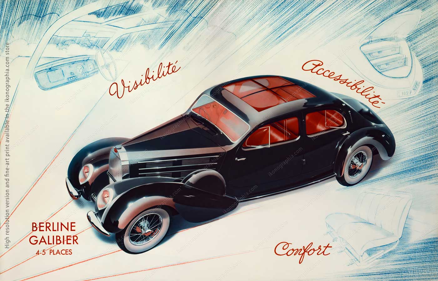
Bugatti Type 57 Modèles 1939. Berline Galibier 4-5 places. Visibilité. Accessibilité. Confort.reet and Regent Street series.

The three words beneath the model name are the brochure's argument in miniature — the same logic that organized the 1936 catalog, compressed into a single line.

The Galibier was the largest body in the Type 57 range. The claims are precise and in the correct order.

Bugatti Type 57 Modeles 1939 Brochure Cabriolet Stelvio - Aravis Cabriolet Stelvio 4 Places Cariolet Aravis 2-3 Places

Bugatti Type 57 Modèles 1939. Cabriolet Stelvio 3 places. Cabriolet Aravis 2-3 places.

Two open bodies on the same page, the Stelvio and the Aravis distinguished by seating capacity and hood treatment.

The mountain names were Jean's choice — the Stelvio Pass, the Col de l'Aravis. He named his cars after roads worth driving.

Carrosserie Gangloff, 1935

Before Jean's body designs became the standard, Bugatti's principal coachbuilder was Carrosserie Gangloff in Colmar, Alsace.
The 1935 Gangloff catalog documents six Type 57 and 57SC body variants — the Coach Aérodynamique, the Cabriolet, the Roadster, the Double Cabriolet, the Coach, the Faux Cabriolet. The photography is monochrome and functional. The cars do not need flattery.

Carrosserie Gangloff, Colmar for Bugatti. The cover of the 1935 catalog.

Carrosserie Gangloff, Colmar. Cover of the 1935 catalog for the Bugatti Type 57.

Gangloff of Colmar was Bugatti's principal coachbuilder before Jean's body designs became the standard.
The 1935 catalog documented what was available before the Atalante, the Atlantic, and the Stelvio existed. A world about to be replaced.

Carrosserie Gangloff, Colmar for Bugatti. Six monochrome pages from the 1935 catalog. Coach Aérodynamique 757 G, Cabriolet 357 G, Roasdster 557 G, Double Cabriolet 147 G, Coach 257G, Faux Cabriolet 657 G.

Carrosserie Gangloff, Colmar — Six pages from the 1935 catalog: Coach Aérodynamique 757G, Cabriolet 357G, Roadster 557G, Double Cabriolet 147G, Coach 257G, Faux Cabriolet 657G.

Six body variants, each assigned a Gangloff reference number.

The Coach Aérodynamique — 757G — was the most forward-looking of the six, the one that acknowledged where design was heading. Within two years, Jean had taken it further than Gangloff had imagined.

The Trains

In the early 1930s, Bugatti faced a financial crisis serious enough that the company's accountant presented the only rational solution: reduce the workforce by at least a third.

Ettore did not respond. He disappeared for a week.

When he came back, he gathered the entire workforce and told them to move all equipment into the smaller building. When they asked why, the answer was short: they would build trains.

In that week alone he had already designed the program. Within two years, the Bugatti Autorail existed: a streamlined railcar unlike anything running on European tracks. Ettore designed ergonomic seats that reversed direction so passengers always faced forward, with fold-out tables built into the backrest. To power the locomotives he used four modified engines from the Type 41 Royale — 12,763cc each, the largest production car engine ever built, now repurposed for rail.

The Autorail set the world rail speed record: 196 km/h, electrically timed over 10 kilometres. The previous record was around 122. He didn't improve it. He erased it.

The French national railway bought the trains. Nobody was let go.

The brochure that documents all of this is printed in blue monochrome — the same controlled hand as every other piece of Bugatti literature. At the bottom, three words: Vitesse. Confort. Sécurité. Not a promise. A statement of fact from a man who had just proved all three.

Carrosserie Gangloff, Colmar for Bugatti. Six monochrome pages from the 1935 catalog. Coach Aérodynamique 757 G, Cabriolet 357 G, Roasdster 557 G, Double Cabriolet 147 G, Coach 257G, Faux Cabriolet 657 G.

Automotive rapides Bugatti — Vitesse — Confort - Sécurité.
Advertisement Sheet 1934.

Record du monde de vitesse sur rail — 196 Kilomètres a l'heure — Chronométreé électriquement sur 10 kilomètres.
October 24, 1934.

Copyright, Links And Credits

Photography, Copyright & Credits

These images are part of the Ikonographia Visual Archives: — Bugatti Heritage Collection —  Bugatti Factory Drawings  Archive.
All drawings reproduced by Roberto Bigano in 1990 from originals held in the Bugatti factory archive. The current location of the originals is unknown.
All photographs © Ikonographia / Roberto Bigano — All Rights Reserved.

Terms of Use (Summary)

The images presented in this archive are copyrighted and available for licensed use only through Ikonographia Visual Archives.

You may not download, reproduce, publish, or distribute these images without a valid license. For commercial or editorial licensing, please refer to the product pages or contact Ikonographia directly. A full explanation of licensing terms is available in the Shop / Licensing Information section under "Ikonographia — Standard License" and "Ikonographia — Merchandising & Product Use Licenses"

The Ikonographia Bugatti Heritage Archive

Between 1990 and 2009, photographer Roberto Bigano documented Bugatti with a level of access that no longer exists and cannot be replicated. The relationship began with Romano Artioli — the Italian entrepreneur who had just acquired the Bugatti name and was preparing its revival at Campogalliano — who gave Roberto carte blanche to work inside the factory, the archive, and every event that followed. No brief. No restrictions. No supervision.

What resulted is not a single project but five distinct bodies of work: the factory technical drawings reproduced before they disappeared, two major photographic commissions on the historic cars, a complete documentary record of the Bugatti International Centenary Meeting in Tuscany, and an Alsatian reportage made inside Molsheim before the restoration began. Together they form one of the most complete private archives of Bugatti heritage in existence — most of it unpublished until now, some of it available nowhere else.

The archive is not a celebration of the marque. It is a record made by someone who was trusted enough to be inside it, at the precise moment when its past and its future were in the same room.

Credits & Acknowledgments

Ikonographia gratefully acknowledges the fundamental contribution of Romano Artioli, founder of Bugatti Automobili, without whose trust and unrestricted access this archive would not exist.

Ikonographia Mission Statement

Ikonographia is committed to the accurate documentation, preservation, and ethical dissemination of twentieth-century visual culture.

Archival Notes

These drawings were reproduced by Roberto Bigano in 1990, during the preparation for the revival of Bugatti Automobili at Campogalliano. Access to the Bugatti factory archive was granted by Romano Artioli. The drawings document the original Molsheim factory production.

Further Reading (Selected Sources)

Augustus Jansson’s Ink Beasts Parade for Queen City Ink 1905

Augustus Jansson’s Ink Beasts Parade for Queen City Ink 1905

Augustus Jansson's Ink Beasts Parade for Queen City Ink 1905

A corporate communication strategy built around the product itself — a decade before anyone else thought of it.

In 1905, Augustus Jansson designed a campaign for Queen City Printing Ink that had no precedent. A sustained corporate narrative — consistent characters, recognisable visual identity, each ad building on the last — printed in the high-density colors Queen City produced. The ink demonstrated itself. Systematic brand communication of this kind would not become standard practice for another decade.

Magenta Ponies entered in Ink beast Parade. By The Queen City Printing Ink company. Ad Art by Augustus Jansson. June 1905.

Magenta Ponies entered in Ink Beast Parade.

Augustus Jansson and Queen City Printing Ink


Augustus Jansson, a Swedish-American illustrator and designer, established a reputation through his original and superior work when he began a seven-year working period for Queen City Printing Ink.

He produced striking ads, often considered ahead of their time, including the renowned Ink Beasts Parade featuring its Magenta Ponies, the Heliotrope Purple Cow, the Orange-Yellow Ibexiatucus, and more. Also relevant is a series of doll-like figures.

The ads were printed on special paper using high-density colors, with a gamut far exceeding that of CMYK print. For this reason, we made a dedicated post-production to fit the original colors as much as possible.
All images are available as hi-res files or fine-art prints.

The Yellow Elephant for The Ink Beast Parade. The Queen City Printing Ink Ad, April 1905. Art by Augustus Jansson

The Yellow Elephant for The Ink Beast Parade.
The Queen City Printing Ink Ad.
The Inland Printer Magazine, April 1905.
Artwork art ad design by Augustus Jansson.

Only Heliotrope Cow in the world for The Ink Beast Parade. The Queen City Printing Ink Ad, May 1905. Art by Augustus Jansson

Only Heliotrope Cow for The Ink Beast Parade.
The Queen City Printing Ink Ad.
The Inland Printer Magazine, May 1905.
Artwork art ad design by Augustus Jansson.

Magenta Ponies for The Ink Beast Parade. The Queen City Printing Ink Ad, June 1905. Art by Augustus Jansson

Magenta Ponies entering The Ink Beast Parade. 
The Queen City Printing Ink Ad.
The Inland Printer Magazine, June 1905.
Artwork art ad design by Augustus Jansson.

Some Striking Designs


The striking designs used by the Queen City Printing Ink Company in the printing trade journals for some months past have been the subject of criticism — good, bad and indifferent by advertising experts.
The grotesque character of the designs gave opportunity for broad color effects, and the brilliancy and striking character of the inks used were thus forced on the attention of the public.

The arguments used in favor of " something more interesting in itself," such as a landscape or a pretty picture as a medium to exploit the inks of the company, did not convince the advertising man in charge, and no matter what opinion one may hold, no one can deny that these angular, staring and stolid figures have made good results, and that their gorgeous raiment has made them as closely identified with the Queen City Printing Ink Company as the Brownies were identified with Palmer Cox.
Excerpt from " The Inland Printer", August 1904.

The Blue Camel for The Ink Beast Parade. The Queen City Printing Ink Ad, July 1905. Art by Augustus Jansson

The Blue Camel for The Ink Beast Parade. 
The Queen City Printing Ink Ad.
The Inland Printer Magazine, July 1905.
Artwork and Ad design by Augustus Jansson.

The Orange Buffalo for The Ink Beast Parade. The Queen City Printing Ink Ad, August 1905. Art by Augustus Jansson

Orange Buffalo for The Ink Beast Parade. 
The Queen City Printing Ink Ad.
The Inland Printer Magazine, August 1905.
Artwork and Ad design by Augustus Jansson.

The Green Giraffe for The Ink Beast Parade. The Queen City Printing Ink Ad, September 1905. Art by Augustus Jansson

Green Giraffe for The Ink Beast Parade. 
The Queen City Printing Ink Ad.
The Inland Printer Magazine, September 1905.
Artwork and Ad design by Augustus Jansson.

Not just a display of creativity but a catalyst for it.


As said, the Ink Beast Parade Ad Campaign was decades ahead of his time.
The ad series was carefully scheduled, introducing the company's most innovative products. The artworks were printed on special paper using the company's exclusive, one-of-a-kind tints; these colors were impossible to reproduce using the standard CMYK palette, adding an element of intrigue to the campaign.

At the bottom of the page, the color codes were listed for ordering purposes and to inspire customers with the creative potential of these unique colors. In short, the campaign was not just a display of creativity but a catalyst for it.
All this may look normal today, but we are speaking of a campaign created 120 years ago!

Yellow and Sapphire Bear for The Ink Beast Parade. The Queen City Printing Ink Ad, August 1905. Art by Augustus Jansson

The Yellow and Sapphire Bear for The Ink Beast Parade. 
The Queen City Printing Ink Ad.
The Inland Printer Magazine, October 1905.
Artwork and Ad design by Augustus Jansson.

The Bronze Red Lion for The Ink Beast Parade. The Queen City Printing Ink Ad, November 1905. Art by Augustus Jansson

Bronze Red Lion for The Ink Beast Parade. 
The Queen City Printing Ink Ad.
The Inland Printer Magazine, November 1905.
Artwork and Ad design by Augustus Jansson.

The Orange Tiger Bear for The Ink Beast Parade. The Queen City Printing Ink Ad, December 1905. Art by Augustus Jansson

Orange Tiger f for The Ink Beast Parade. 
The Queen City Printing Ink Ad.
The Inland Printer Magazine, December 1905.
Artwork and Ad design by Augustus Jansson.

The Bronze Blue Unicorn in Ink beast Parade. By The Queen City Printing Ink company. Ad Art by Augustus Jansson. January 1906.

Bronze Blue Unicorn for The Ink Beast Parade. 
The Queen City Printing Ink Ad.
The Inland Printer Magazine, January 1906.
Artwork and Ad design by Augustus Jansson.

The Yellow Ibex for The Ink Beast Parade. The Queen City Printing Ink Ad, February 1906. Art by Augustus Jansson

Yellow Ibex for The Ink Beast Parade. 
The Queen City Printing Ink Ad.
The Inland Printer Magazine, February 1906.
Artwork and Ad design by Augustus Jansson.

The Red Boar for The Ink Beast Parade. The Queen City Printing Ink Ad, September 1906. Art by Augustus Jansson

Read Boar for The Ink Beast Parade. 
The Queen City Printing Ink Ad.
The Inland Printer Magazine, February 1906.
Artwork and Ad design by Augustus Jansson.

Copyright and credits

Arworks and ads design by Augustus Janson.
The adverts are from 1905 and 1906 and the artist passed away in 1931. Consequently the copyright of all images has expired.

Bugatti Masterpieces of 1920s and 1930s. By Roberto Bigano

Bugatti Masterpieces of 1920s and 1930s. By Roberto Bigano

Bugatti Masterpieces of 1920s and 1930s. By Roberto Bigano

Two sessions, two decades apart — the museum and the meeting.

Vintage Bugatti masterpieces photographed by Roberto Bigano across two sessions. The iconic Atalante and Atlantic from the Divina Bugatti sessions at the Musée National de l'Automobile in Mulhouse — the FMR commission. The legendary Type 13, Type 35, and Type 40A from the Bugatti Glamour Sessions — four nights of open-air studio photography during the Centenary celebrations in Tuscany, with the owners present — two bodies of work. Available nowhere else.

Bugatti Type 37A, "Flighty" (1928) - Owners, Frederica and Simon Fitzpatrick, Guernsey © Roberto Bigano/ ikonographoa.com Browse the Bugatti Archive https://www.ikonographia.com/archive/the-bugatti-archive/

Bugatti Type 37A, "Flighty" (1928) - Owners Frederica and Simon Fitzpatrick, Guernsey.

Bugatti Masterpieces. A gallery of the most iconic models.


Ikonographia is proud to showcase a gallery of the most iconic vintage Bugatti models, highlighted by the splendid images of Roberto Bigano. The models range from the legendary Type 13 and Type 35 racing models to the stylish Type 57 Atalante and Atlantic designed by Jean Bugatti.
All the images are available in high-resolution or fine-art prints.
This is a work-in-progess page. We are going to add more contents. Please stay in touch.

A 1937 Bugatti Type 57SC Coupé Atlantic lightened in silhouette mode to emphasize the flowing coupé lines

A 1937 Bugatti Type 57SC Coupé Atlantic. Detail of the windshield and wipers emphasizing the riveted crest.
Jean Bugatti designed the half-body ending in a crest. He then reverted the first part right-left and finally joined the two pieces with rivets in one of the most daring automotive designs. Courtesy: British Garage, Paris.

About Ettore and Jean Bugatti.


Automobiles Ettore Bugatti was a French car manufacturer of high-performance cars, founded in 1909 in Molsheim, Alsace, France, by the Italian industrial designer Ettore Bugatti. The firm produced about 8,000 cars and is known for its design beauty and many race victories.

Ettore Bugatti himself designed his creations (together with his highly talented son Jean, who later took to the drawing board alone). This extraordinary man had attended the Brera School of Art as a youth, yielding an artistic streak inherited from his father, Carlo (a fine cabinet-maker). The founding genius of the Bugatti firm also demonstrated an astonishing ability for mechanical engineering and an amazingly eclectic mind in general.

This flair had also gone to his brother Rembrandt, the talented sculptor whose works include the little elephant triumphing on the Royale’s bonnet. 

The legendary Ettore Bugatti's signature on the engine head of a 1921 Type 13 Brescia. Photo by Roberto Bigano. Buy this image in the ikonographia.com store.

The legendary Ettore Bugatti's signature on the engine head of a 1921 Type 13 Brescia.

A gallery of Masterpieces. Let's start with the Type 13 Brescia.


The Bugatti Type 13, Brescia, was the first actual Bugatti produced from 1910 to 1926. Thanks to the race victories, Bugatti became known as pur-sang (thoroughbred), keeping with Ettore Bugatti's feelings for his designs.
The Bugatti Type 13, Brescia, was fast and technically superior, making it virtually unbeatable. This was evident in the 1921 Brescia Grand Prix, where Bugatti's cars finished in the top four places, sparking a surge in orders. With the introduction of the "Brescia," Ettore Bugatti fundamentally changed the racing scene, as his cars won almost every competition they entered in the 1920s, cementing their place in racing history.

The initial Brescia featured a basic, functional design so rudimentary and simplistic that it earned the nickname "Bagnoire" (bathtub), a term reflecting its unique shape and design.
The Brescia design was later refined, as evidenced by the exquisite yellow sample below.

Bugatti Type 13 Brescia, 1921. Photo by Roberto Bigano. Buy this image at https://www.ikonographia.com/archive/the-bugatti-archive/

Bugatti Type 13 Brescia Cabriolet, 1923.

The Bugatti Type 35.


The Bugatti Type 35 is an iconic race car design produced between 1924 and 1930. It was phenomenally successful, winning over 1,000 races in its time. In 1926, it took the Grand Prix World Championship after winning 351 races and setting 47 records in the two prior years.

At its height, the Type 35 averaged 14 weekly race wins, including the prestigious Targa Florio for five consecutive years, from 1925 through 1929.

Bugatti Type 35B Grand Prix Biplace Course - Two Seater Racing

Bugatti Type 35B Grand Prix Biplace Course Two-Seater Racing 1927.
The Type 35 is an iconic race car design produced between 1924 and 1930. It was phenomenally successful, winning over 1,000 races in its time. At its height, the Type 35 averaged 14 weekly race wins, including the prestigious Targa Florio for five consecutive years, from 1925 through 1929.

Dashboard of a Bugatti Type 35B Grand-Prix (1927) - Courtesy: Musée National de l’Automobile Mulhouse

The dashboard of a Bugatti Type 35B Grand-Prix (1927) – Courtesy: Musée National de l’Automobile Mulhouse.

Bugatti Type 35A, 1926. Owned by Gigi Baulino & Enrica Varese. © Roberto Bigano/ ikonographoa.com Browse the Bugatti Archive https://www.ikonographia.com/archive/the-bugatti-archive/

Bugatti Type 35A, 1926. Owners Gigi Baulino & Enrica Varese, Italy. Picture taken at Bugatti International Meeting 2009. Hasselblad 39 Multishot Camera High-resolution file.
The owner forbade the photographer from washing the car so as not to erase the dirt from the race, which made it fascinating.
Watch the video of this event >

The Bugatti Type 41 Royale.


The Bugatti Type 41 Royale was gorgeous in its seven-meter length. It was enormous, had the most oversized wheels, and was the longest and tallest limo. Her design and form would smoothly conceal the captivating exuberance of an eight-cylinder motor for an impressive 12,773 cubic meters capacity that defines once and for all the original idea of a car.

Only seven Royales were produced. We showcase the "Coupè Napoleon," Ettore Bugatti's car, and the Bugatti Type 41 Esders Roadster, probably the most elegant.

Bugatti Type 41 Royale Coupé Napoleon (1929) The personal car of Ettore Bugatti. Courtesy: Musée National de l'Automobile, Mulhouse. Photo by Roberto Bigano. Courtesy: Courtesy: Musée National de l’Automobile Mulhouse. Buy this image at Ikonographia.com store

Bugatti Type 41 Royale Coupé Napoleon (1929), the personal car of Ettore Bugatti. On top of the radiator grill is the symbol of the Royales, the Elephant carved by Rembrandt Bugatti. Courtesy: Museé National de l'Automobile, Mulhouse.

The Bugatti Royale's Prancing Elephant, according to Antonio Tabucchi.


There has never been such an expensive car. Only seven Bugatti Royale were built, each one different. Upon the radiator grill, the Royale and the Petit Royale had a prancing elephant carved by Rembrandt Bugatti, Ettore's brother, as a symbol.  You can find it described in Rebus, a short tale by Antonio Tabucchi. Here is an excerpt.

The Bugatti Royale, according to Antonio Tabucchi.

It really was a Bugatti Royale, a Coupé de Ville; I don't know if that means anything to you, Monsieur […] Albert couldn't believe his eyes. It's not possible; it's not possible, he repeated to himself while stroking the long-tempered bumpers.

I don't know if you understand, but a Bugatti gives one the idea of a woman's body lying down on her back with her legs forward […] The elephant was missing from the bonnet. That was the only awful surprise. Maybe you may not know, or perhaps you just haven't noticed, that Bugatti had a figurine of a silver statue of an elephant on the bonnet, right on top of the radiator grill. It was a sculpture by Ettore's brother, Rembrandt Bugatti. It wasn't only a trademark, like the Rolls Royce Winged Victory of Samothrace or the Packard's Swan, but a tangible symbol to be deciphered like every other symbol. It was an elephant standing on his back legs, with the erect trunk symbolizing aggression and coupling.

Does it seem too easy to explain? Perhaps. But think about it: a Bugatti Royale lying on its back, going slowly uphill, wings spread open, ready to speed up, ready for the thrill, with that fabulous radiator grill protecting its pulsating life and energy, and on the top an elephant with an erect trunk.
Excerpt from the short story "Rebus" in "Little Misunderstandings of No Importance" "(Piccoli equivoci senza importanza), by Antonio Tabucchi.

Leggi il testo originale italiano.

"Rebus." Da "Piccoli equivoci senza importanza."


“Era proprio una Bugatti Royale, un coupé de ville, non so se a lei dice qualcosa, Monsieur (...) Albert non credeva ai suoi occhi, non è possibile, ripeteva, non è possibile, e accarezzava i parafanghi affusolati e lunghi, non so se lei riesce a capire, ma nella Bugatti c'è l'idea del corpo femminile, una donna, appoggiata sulla schiena con le gambe in avanti (...)

Mancava l'elefante sul cofano, fu l'unica brutta sorpresa (...) Forse lei non lo sa, o non ci ha mai fatto caso, ma la Bugatti aveva sul cofano, proprio all'apice della volta della griglia, la statuetta d'argento di un elefante. Era una scultura del fratello di Ettore, Rembrandt Bugatti, e non era solo un marchio della casa, come la vittoria alata della Rolls o il cigno della Packard, quello era un vero simbolo, misterioso da decifrare come tutti i simboli, era un elefante in piedi sulle zampe posteriori e la proboscide eretta in un barrito di aggressione o di accoppiamento.

The Elephant carved by Rembrandt Bugatti, right on top of the radiator grill of the Type 41 Royale Coupé Napoleon, the personal car of Ettore Bugatti. It was an elephant standing on his back legs, with the erect trunk as a symbol of aggression and coupling (1929) - Courtesy: Musée National de l'Automobile, Mulhouse

The Elephant by Rembrandt Bugatti, right on top of the radiator grill of the Type 41 Royale Coupé Napoleon, the personal car of Ettore Bugatti (1929). It was the symbol of the Royales. 

Bugatti Type 55 Sport Roadster and Coupé


The Type 55 was introduced at the 1931 Paris Motor Show. It was produced until 1935 in 38 samples, Roadster and Coupé, most of which had factory bodywork elegantly designed by Jean Bugatti.
Like many high-end automakers, Bugatti used its success in competition to promote its road cars. This already happened with the Type 13 Brescia and the Type 35.
The Type 55 was a direct descendant of the Type 51 race car and was similarly powered by a supercharged 2.3-litre dual-overhead-cam inline-eight.

We showcase here two pictures of the Roadster and Coupé, with the classic factory bodywork by Jean Bugatti.

Bugatti Type 55 Sport Roadster 1932. Road version of the Type 51 Grand Prix, produced in 38 smaples from 1932 to 1935.

Bugatti Type 55 Roadster, as designed by Jean Bugatti.  Courtesy: Museé National de l'Automobile, Mulhouse.

Bugatti Type 55 Sport Coupe 1932. Road version of the Type 51 Grand Prix, produced in 38 smaples from 1932 to 1935.

Bugatti Type 55 Coupé, as designed by Jean Bugatti.  Courtesy: Museé National de l'Automobile, Mulhouse.

Bugatti Type 59-50B Grand Prix Monoplace Course - Single Seater 1938 - Courtesy: Musée National de l’Automobile Mulhouse

Bugatti Type 59-50B Grand Prix Monoplace Course - Single Seater 1938

Social Events in 1920s High Society. By Fish

Social Events in 1920s High Society. By Fish

Social Events in 1920s High Society. By Fish

Fish on theatre, opera, country houses, and the social calendar.

The double-page plates of High Society are organized here into six thematic chapters. This second chapter covers the social calendar — theatre, opera, sporting events, country house weekends — the rituals through which high society performed itself in public.
First published in Vanity Fair between 1914 and 1920. Texts by Dorothy Parker and George S. Chappell.

All pages reproduced from the original book.

Can you guess whos' in th stage?

Can You Guess Who's on the Stage. Detail from Who's Who in the Audience.

A Pictorial Guide to Life in Upper Circles. Part Two.


This is the second story about Anne Fish’s work, which documents and satirizes high society at the turn of the 1910s to 1920s.
The double-page plates were first published in Vanity Fair between 1914 and 1920 and then re-published in the splendid book “High Society. Hints on how to Attain, Relish – and Survive It. A Pictorial Guide to Life in our Upper Circles.”, published in December 1920.
Any double-page plate focuses on a specific topic, providing a unique, rich lens into American and international high society’s lifestyles of the 1910s and 1920s. Rigorously in ink & pen, these inimitable sketches are completed with entertaining captions.
We grouped the plates into six sections, each on a central topic. This second one is on “Social Events in 1920s High Society”.

Index to High Society 1920s Stories.

The Opening of the Social Season, from “High Society”, pages 02-03. By Anne Fish 1920 How the Members of the Beau Monde Will Spend What Is Left of Their War-time Incomes.

The Opening of the Social Season.
How the Members of the Beau Monde Will Spend What Is Left of Their War-time Incomes.
Initially published in Vanity Fair, November 1917.

EXCERPT FROM THE CAPTIONS

THE ART SHOWS.

Below we see the opening of the Vorticist Sculpture Salon, a debauch in marble that always brings out a full quota of the artistic cognoscenti of the town. Bohemia always appears in goodly numbers at these charming little revels in stone.

The extraordinary thing about much of the new sculpture is that it looks like illustrations for those wonderful books on hygiene, in which ladies' are taking their matutinal exercises—by correspondence, of course. Take, for instance, the case of the delicate little gem entitled "Love" in this illustration. Captain De Pluyster who is viewing it in company with his fiancée, Miss Corinna Walpole, is listening to her: "Oh, that's an easy one. I do that twenty times, every morning, just before my bath."

TOPIC LIST:

THE RESTAURANTS
THE HORSE SHOW
THE ART SHOWS
THE FASHION FÊTES

The full text is available in the metadata of the hi-res file in the shop.

The Opera in Full Blast, from “High Society”, pages 04-05. Art by Anne Fish 1920

The Opera in Full Blast.
Showing That Things Are Sounding Much as Usual At the Opera This Year.
Initially published in Vanity Fair, January 1918.

EXCERPT FROM THE CAPTIONS

HOME, SWEET HOME.

Below, you will behold a little scene in Pneumonia Alley otherwise known as the lobby of the opera. It is here that all of our best people gather, after the opera, and wait for hours for their flunkeys and limousines. Fashionable personages are really much cleverer than mere people are wont to suppose. After twenty years of hard study, they have finally devised a system by which — after the opera — they can wait around in the lobby for their motors and reach their houses only an hour later than they would if they left by the main door and picked up a passing taxi.

TOPICS LIST:

AN OPERATIC DUET.
HOME, SWEET HOME.
HEARTS AND FLOWERS.
THE SPELL OF MUSIC.

The full text is available in the metadata of the hi-res file in the shop.

Getting On, in Smart Society, from “High Society”, pages 08-09. By Anne Fish 1920 If, at First, You Don't Succeed, Dine 'em and Dine 'em Again Initially published in Vanity Fair, October 1916 with title GETTING ON IN NEW YORK SOCIETY If at First You Don’t Succeed, Dine ‘em and Dine ‘em again THE PEN AND THE INKS BY FISH

Getting On, in Smart Society.
If, at First, You Don't Succeed, Dine 'em and Dine 'em Again
Initially published in Vanity Fair, October 1916.

EXCERPT FROM THE CAPTIONS

HEARTS AND DIAMONDS.

The Higgingbothams were told that they could do nothing without a social secretary. They accordingly engaged Miss Audrey De Vere, a young lady of lineage. Audrey smokes, drinks, and plays "poker": she also knows how to get first-night tickets at the theatres and an outside table at a cabaret. She can mix eleven different kinds of cocktails with only one bottle of gin, one lemon, two bottles of Vermouth and a single olive. She is engaged to a war hero — her vis-a-vis at this table. The dinner has been cleared away and Audrey and her friends have just finished a little session with the cards. Net result: the T. Pennypacker Higgingbothams are minus the value of one small Texas oil well.

TOPIC LIST:

IN THE INTELLECTUAL SET.
HEARTS AND DIAMONDS.
THE RECEPTION COMMITTEE.
THE ATTACK ON BOHEMIA.
SUCCESS AT LAST.
HE'S A JOLLY GOOD FELLOW.

The full text is available in the metadata of the hi-res file in the shop.

Who’s Who—in the Audience. Art Anne Fish 1920, Text by Dorothy Parker - High Society, pages 48-49. Showing That the Smart Playgoer, Not the Smart Play, Is Really the Thing.

Who’s Who—in the Audience.
Showing That the Smart Playgoer, Not the Smart Play, Is Really the Thing.
Initially published in Vanity Fair, April 1919.

EXCERPT FROM THE CAPTIONS

CAN YOU GUESS WHO'S ON THE STAGE?

You can always tell, by looking at the audience, just who is holding the center of the stage. When the masculine half of the audience occupies itself in reading the corset advertisements in the programmes or in looking restlessly about while the feminine half strains to catch every word—then you can be sure that the marcelled hero, in the jet-buttoned evening clothes, with the velvet collar, is standing in the spotlight and singing, or talking, rhapsodically about the age-old passion of LOVE.

TOPIC LIST:

IT'S ALL IN THE LINES.
CINEMA LOVERS.
CAN YOU GUESS WHO'S ON THE STAGE?
DOUBLE ENTENDRES.
FOR THE CHILDREN’S SAKE.
CAN YOU GUESS WHO'S ON THE STAGE NOW?

The full text is available in the metadata of the hi-res file in the shop.

Opening of the Opera Season - Blighters at Bridge. Art Anne Fish 1920, Text by Dorothy Parker - High Society, pages 54-55 A Terrifying Triumvirate of Familiar Lady Auction Pests

Opening of the Opera Season - Blighters at Bridge.
A Terrifying Triumvirate of Familiar Lady Auction Pests.
Initially published in Vanity Fair, August 1920.

EXCERPT FROM THE CAPTIONS

THE POOR, INNOCENT VICTIM.

What type of bridge player is the most spirit-blighting? Some favor the talking player; some the cheat — but we must vote, on every ballot, for the three girlies mirrored on this page. First, there is the creature shown above, who, after losing five rubbers, suddenly registers horror with the orbs, and exclaims in dismay: " Heavens! are we playing for money? I never dreamed of such a thing! I never play for anything!" Note the indifference of the other participants — intensified by financial anguish.

TOPIC LIST:

OPENING OF THE OPERA SEASON.
THE POOR, INNOCENT VICTIM.
THE BLIGHTER, PAR EXCELLENCE.
THE HOODOO-ED DOWAGER

The full text is available in the metadata of the hi-res file in the shop.

Social Superstitions. Art Anne Fish 1920, Text by Dorothy Parker - High Society, pages 46-47 With Very Special Obeisances to Cupid

Social Superstitions.
With Very Special Obeisances to Cupid.
Initially published in Vanity Fair, October 1920 with title Social Superstitions Lovelorn sketches 

EXCERPT FROM THE CAPTIONS

SALT AND BATTERY.

Because Clarice Vanderhoff almost fainted when her fiancé, Teddy Ashhurst, spilled the salt, Ted natural! placated the Unknown Gods by throwing a handful of the offending seasoning over his left shoulder with his right hand. This is undoubtedly very pleasing to the Fates and Goddesses of Chance, but hardly as agreeable to the charming Mrs. Drexel-Drexel who, quite naturally, objects to being salted, like an almond — particularly in public.

TOPIC LIST:

THE SHEEP—AND THE GOAT.
THE SUIT AND THE SUITOR.
THE WORST IS YET TO COME .
SALT AND BATTERY .
THE CROIX DE COUTEAUX .
DANGEROUS DIANA.

The full text is available in the metadata of the hi-res file in the shop.

EUR Euro