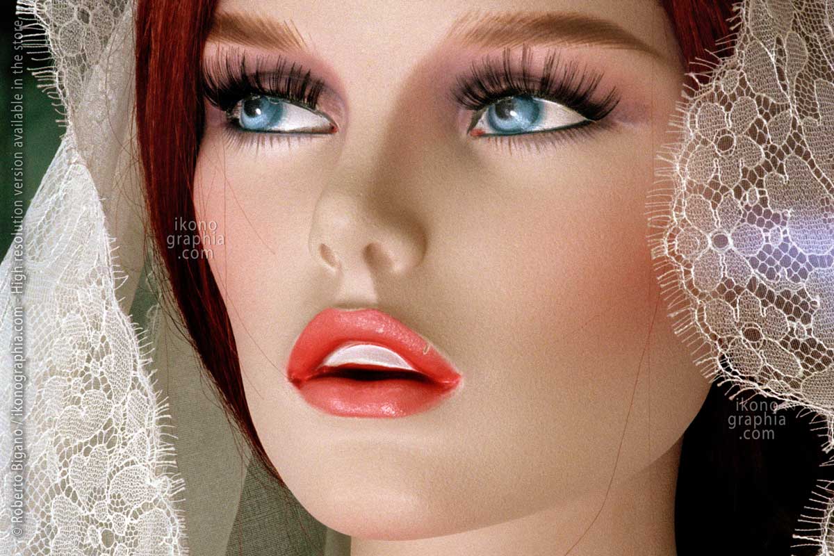
Celebrating the Art Deco Centenary. 1925-2025
Celebrating the Art Deco Centenary — 1925-2025
A hundred years since the 1925 Paris Exhibition gave the movement its name — Ikonographia's response.
In 1925, the Exposition Internationale des Arts Décoratifs et Industriels Modernes in Paris gave Art Deco its name and its international reach. A hundred years later, the movement's visual legacy remains active — in the metalwork of Manhattan's lobbies, in the graphic language of Erté and Cassandre, in the automotive design of Bugatti and the decorative glass of Serge Roche.
This page brings together Ikonographia's existing Art Deco archives and stories as a single centenary overview — photography, illustration, graphic design, and decorative arts, documented across a century.

NYC Art Deco Elevator’s door silver-nickel (a rare alloy of copper and nickel) decorative ironwork. 1931
New York City, 20 Exchange Place, formerly the City Bank–Farmers Trust Building.
What is Art Deco
Art Deco, short for "Arts Décoratifs," is a visual arts, architecture, and product design movement emerged in Paris during the 1910s and gained prominence in the U.S. and Europe from the 1920s to the early 1940s. Popularized by designers like Erté and Paul Poiret, it became the dominant style following the 1925 Exhibition in Paris.
At its peak in the late 1920s, Art Deco was more than just a style; it was a movement, a way of thinking that symbolized luxury, glamour, and exuberance. Above all, it represented hope and confidence in social and technological progress.
Characterized by exquisite craftsmanship, luxury, glamour, and innovative materials such as stainless steel and plastic, Art Deco represented hope and confidence in technological progress. Its influence can be seen in architecture, from skyscrapers to everyday objects, as well as in advertising and illustration, leaving a lasting impact on 20th-century culture.

Hat Design by Paul Poiret; artwork by Georges Lepape, from the 1911 Catalog "Les choses de Paul Poiret."
The Art Deco movement emerged in Paris during the 1910s, popularized by designers like Erté and Paul Poiret.
The International Exhibition of Modern Decorative and Industrial Arts
The International Exhibition of Modern Decorative and Industrial Arts (Exposition Internationale des arts décoratifs et industriels modernes) was held in Paris in 1925. During its seven-month run, 15,000 exhibitors from twenty countries and sixteen million people visited the exhibition, which had an enormous impact worldwide.
The term "Art Deco" originated from this exposition. While the style debuted in Paris during the 1910s, it is conventionally considered officially established in 1925. Thus, 2025 marks the centenary of Art Deco, and Ikonographia is preparing to celebrate with twelve monthly stories honoring this iconic movement.
This first part is a preview of what we are going to publish.

Exposition International Des Arts Decoratifs 1925, poster by Robert Bonfils.
International Exhibition of Modern Decorative and Industrial Arts, held in Paris in 1925.
New York City Art Deco Architecture
Although the United States did not officially participate in the Exhibition, many talented American architects and artists from New York City attended and returned inspired. They embraced the Art Deco style and reinvented it, making American Art Deco a distinctly original architectural movement.
Art Deco flourished in New York City during the 1920s and 1930s, influenced by global decorative arts trends, mechanization, and the 1916 Zoning Resolution, which promoted innovative designs with setbacks. This style broke traditional norms, featuring verticality, ornamentation, and new materials like plastics and metals.
The economic boom of the Roaring Twenties led to a citywide building surge, with Art Deco evident in everything from soaring skyscrapers to modest homes and municipal buildings. Lavishly decorated skyscrapers defined Manhattan’s skyline until the Great Depression curtailed their construction.

Art Deco Frozen Fountain Decoration, inspired by Edgar Brandt’s gates, exhibited at the 1925 Exposition in Paris. Madison Belmont Building, 183 Madison Avenue, New York City. Photo by Roberto Bigano.
Art Deco got its name in 1966
The term 'Art Deco' wasn't officially used until 1966, initially referred to as "Le Style Moderne" or "Jazz Moderne." It gained prominence after the Museum of Decorative Arts in Paris’s 1966 exhibition, 'Les Années 25.' The name was solidified in 1968 during a scholarly reappraisal.
Although Art Deco originated in the 1910s in France, we celebrate its centenary in 2025 because the 1925 Exhibition marked a significant moment in art and design, leading to its growth, especially in the United States.

Les Annes ’25’ Art Deco. Bauhaus. Stijl. Esprit nouveau. Poster 1966.
This exhibition made the debut of the term “Art Deco.”
The Chanin Building Radiator Grilles by Rene Paul Chambellan
The New York City Chanin Building was built for Irwin S. Chanin in 1929. The Chanin Building in New York City was constructed for Irwin S. Chanin in 1929. It is a prime example of Art Deco architecture, housing a collection of exceptional masterpieces.
The lobby is designed around the concept of the "City of Opportunity," featuring a geometric motif that symbolizes human thought and emotion.
We'll focus on the notable Radiator Grilles in the vestibules of the building, crafted by Paul Bellentan on a concept by Jaques Delamarre. With a geometric, abstract design symbolizing human thought and emotion. These grilles are among the finest illustrations of the concept, design, and craftsmanship of Art Deco in New York City, highlighting the movement's significance.

Success. Art Deco Gilded Bronze Radiator Grill in the vestibule of the Chanin Building in Manhattan. By Rene Paul Chambellan 1929.
From "The City of Opportunity - Physical Series."
The Eglomized Glass and Mirrors by Serge Roche
Serge Roche, born in France in 1898, was an eclectic artist, though he would best be defined as an interior decorator. In addition to this, he was a remarkable antiquarian, sculptor, designer, and organizer of significant exhibitions. His studio, located at 125 Boulevard Haussmann, served as a global hub for decades, attracting the elite of the Parisian and international artistic community.
By 1934, he had developed a unique style that became the focus of his first exhibition, featuring mirrors and ‘mirror and glass objects.’ He employed a technique known as 'Eglomization,' which involves embedding foreign materials within glass paste. The upcoming article will showcase a selection of these stunning creations.

“Eglomized” octagonal mirror framed by panels featuring mythical creatures by Maison Serge Roche. The craftsmanship was likely done by Max Ingrand in 1933. The eglomization technique consisted of embedding foreign elements in the mirror’s glass paste, producing an endless array of variations. Collection Laurent Marechal.
The Lavish Interiors of the Assyrian-themed Fred French Building in NYC.
The Fred French Building, styled with Assyrian themes, stands out as one of the city's most elaborate and extravagant examples of Art Deco architecture. At the time, there was a great interest in Ancient Egypt and the Ancient Near East.
The lobby walls are clad with marble and contain decorative details such as chevrons, palmettes, volutes, merlons, and lotus flowers, as well as representations of animals such as lions and winged bulls.
The elevator lobby features several decorative bronze features, the most notable of which are the eight panels of the gilt-bronze double-leaf elevator doors.
Lastly, an impressive Assyrian Revival mailbox features a bald eagle, the United States Post Office symbol, and two winged griffins.

Whenever you see an Arrow, Think of Coca-Cola - Get What You Ask For. Red Book Magazine, July 1910.
The London Underground Art-Deco Posters
Poster art flourished in Britain during the 1920s and 1930s, thanks to progressive clients such as the Great Western Railway (GWR), the London North Eastern Railway (LNER), and Shell-Mex.
However, the most impressive and trending production came from the London Underground. They utilized London’s most prominent advertising spaces, which functioned like a public art gallery, reaching a vast audience and creating iconic images.
We will showcase a selection of these masterpieces.

Smelling The Riches Of London.
A 1927 poster by Frederick Charles Herrick for London’s Underground.
The poster is part of a series of four inviting to enjoy London through the senses: smelling, tasting, seeing, and hearing.
The use of color was highly innovative, with distinct tones assigned to each subject.
Art Deco in U.S Advertisement
The Art Deco style was prominently featured in advertising across the United States. We will showcase a collection of the finest advertisements from magazines such as Fortune, Harper's Bazaar, The New Yorker, Vanity Fair, and others, highlighting brands like Cadillac, Rolls Royce, Timken, and more.

Art Deco Automotive Advertisement by John Whitcombe. On and on they go, Timken Bearings, Fortune, December 1934
Art Deco in Magazine Covers
The Art Deco style was exceptionally suited for magazine cover design. We will present a captivating selection of iconic covers from the 1920s, featuring renowned titles such as The New Yorker, The Chicagoan, Harper's Bazaar, and Vanity Fair, created by both well-known and lesser-known artists.

1929 Chicago by Night. Art Deco Cover by Nat Karson, with its unmistakable style
The Chicagoan Magazine September 28, 1929.
Art Deco Iconic Cartoons by Anne Fish for Harper's Bazaar.
From 1914 to 1926, Anne Harriet Fish created hundreds of covers and cartoons for Vanity Fair.
In October 1927, an advertisement in the New Yorker titled "The Biggest Catch of The Season" solemnly announced that "The internationally known"Fish" has just been landed to join the Bazar Staff. This springhty English artist will present to the appreciative audience of Harper's Bazar a first interpretation of its vanities and vagaries—in the December issue."
With this new batch of cartoons, Anne Fish refreshed her style, incorporating some Art Deco elements while preserving her distinctive wit. We will be publishing a selection of double-page cartoons from 1928 and 1929.

New Year Resolutions are made to be broken. But these are quite easy to Keep.
Anne Fish for Harper’s Bazaar, January 1928.
Erté and Art Deco
Romain de Tirtoff, aka Erté, pioneered the Art Deco style.
After designing his first cover for Harper’s Bazaar in 1915, Erté secured a ten-year exclusive contract with the magazine. This decision proved to be highly perceptive.
Between 1915 and 1936, Erté created over 240 covers featuring his signature Art Deco-style illustrations, which combined bold areas of solid color with intricate, whimsical details.
While Erté is most recognized for his covers, his editorial content—often in double-page spreads with original designs—set fashion trends for decades.

A splendid design by Ertè for Harper’s Bazar, December 1924, Christmas Number.
Art Deco Ads Illustration for British Dunlop
During the 1930s, British Dunlop produced a striking series of ads, each featuring an image of Dunlop tires on Cars, Trucks, and Planes. What makes these ads stand out is their depiction of diverse social situations, which provides a rich insight into the society of the time.
Despite their publication in prominent British magazines, the illustrators' names and other crucial details of these ads remain mysterious.

Distinction. Wealthy couple in evening dress. Dunlop Reinforced Tyre ad 1933.
From the Bystander Magazine, March 22, 1933
Copyright, Links and credits
NYC Art Deco and Serge Roche Photographs are copyrighted to Roberto Bigano.
LINKS:
The Art Story: Summary of Art Deco >
The Architectural Forum, May 1929
Reliefs And Grilles Of The Chanin Building Vestibules. Page 693 >
By Rayne Adams.