Portfolio Magazine — Brodovitch and the Reinvention of Editorial Design
A reconstructed selection of the magazine’s original double spreads, revealing its hidden visual architecture.
Published between 1950 and 1951, Portfolio was not conceived as a magazine in the conventional sense, but as an experimental platform for a new visual language. Under the direction of Alexey Brodovitch, each issue functioned as a laboratory where photography, typography, illustration, and editorial sequencing were treated as a single, integrated system.
This featured story is an editorial hub, conceived as a new re-editing of multiple existing stories and archival materials. It brings together previously separate contents into a single, coherent narrative framework, allowing the visitor to explore the subject in depth and as a whole rather than as isolated fragments.
Ikonographia presents here, and in related stories, selected contents as reconstructed double page spreads. For decades, much of the magazine design logic remained partially invisible: the central areas of many double-page spreads were lost in the gutter. What emerges is a clearer understanding of Portfolio not as a collection of images, but as a deliberately sequenced visual system.
Portfolio Magazine N. 1
Winter 1950.
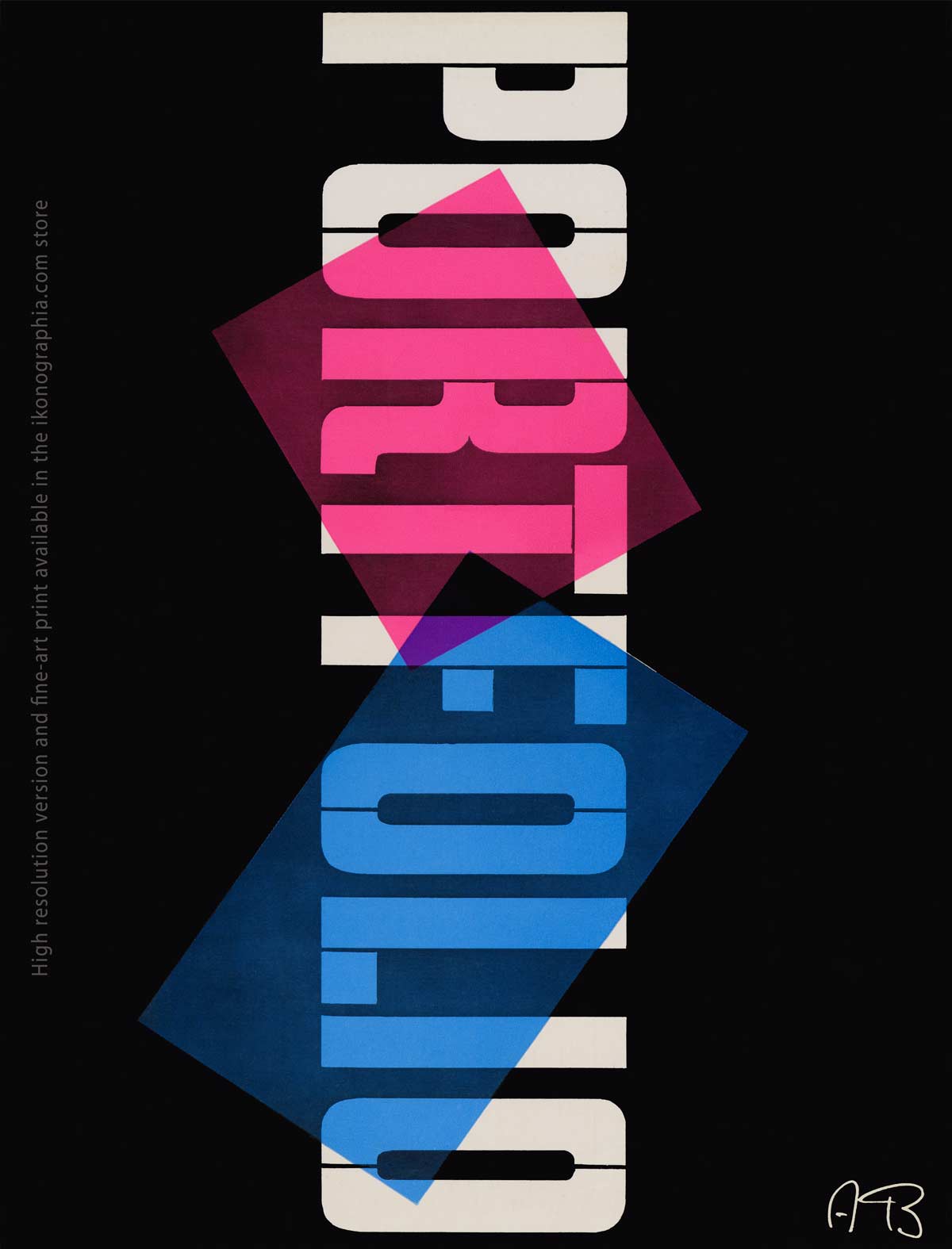
The first issue of Portfolio Magazine, entirely conceived and designed by Alexey Brodovitch, announcing a new editorial language built on sequence, contrast, and visual tension rather than fixed layout.
Featured image above:
The colophon of Portfolio Magazine N. 1
Winter 1950.
The featured image illustrates the philosophy of Portfolio and the importance of reconstructing its double-page spreads as unified visual fields — something period readers could never fully experience due to tight binding, scale, and print constraints.
The Albro Alphabet Typeface.
A Typeface designed by Alexey Brodovitch. The Albro Alphabet (after the first syllables of his name) was inspired by the signs and symbols of musical notation. It was released through Photo-Lettering, Inc., New York.
Portfolio Magazine — Brodovitch.
An Experimental Platform for Modern Editorial Design.
Portfolio was not conceived as a magazine in the conventional sense, but as a radical editorial experiment. Published between 1950 and 1951, it functioned as an open laboratory in which photography, typography, illustration, and sequencing were treated as a single expressive system rather than as separate disciplines.
Under the direction of Alexey Brodovitch, each issue rejected fixed layouts, recurring formats, and commercial constraints. Pages were assembled through contrast, rhythm, and interruption, allowing images and text to interact dynamically across spreads. White space, scale shifts, and abrupt visual transitions became active elements of meaning rather than neutral containers.
Produced without advertising and printed in limited numbers, Portfolio was financially unsustainable but intellectually decisive. Only three issues were released, yet their influence proved disproportionate: the magazine established a new model of editorial authorship, redefining the role of the art director as both editor and composer of visual narratives.
Seen today as a continuous sequence rather than a set of iconic pages, Portfolio remains a foundational document of modern editorial design.
Selected Contents from Portfolio No. 1 (Winter 1950)
The first issue of Portfolio arrived as a shock.
Radically free from editorial convention, it announced a new way of thinking about graphic design—one grounded in curiosity, experimentation, and the belief that visual culture could emerge from any discipline.
The opening article paid homage to Giambattista Bodoni, described as “an Italian genius who created Bodoni, America’s most widely used typeface.”
From there, Brodovitch’s insatiable curiosity and rejection of fixed formats led the magazine into unexpected territories, where science, technology, and art converged.
This issue includes:
Design from the Mathematicians — abstract structures and forms derived from mathematical research.
Xerography — new visual effects generated through powde
Saul Steinberg — drawings selected from unpublished private sketchbooks.
Xerography. New Visual Effects with Powder and Electricity.
Pages 42-43. Four xerographic studies of a water goblet show the various effects possible with the process
Selected Contents from Portfolio No. 2 (Summer 1951)
The second issue of Portfolio confirmed the scope of Brodovitch’s experiment.
If the first issue announced a rupture, the second demonstrated that this was not an isolated provocation but a sustained editorial vision. Brodovitch expanded the magazine’s range, bringing together unpublished works, historical references, and contemporary experiments into a single, fluid sequence.
Rather than consolidating a style, Portfolio No. 2 pushed further into unexplored territory. Page design became a medium of invention in itself, while fine art, graphic experimentation, poetry, and vernacular culture were treated with equal seriousness. The magazine refused hierarchies, allowing visual intelligence to emerge from radically different sources.
This issue includes:
Page Design as a medium of invention — classic layouts reinterpreted by Alexey Brodovitch through rhythm, contrast, and disruption.
Miró on the walls — experimental wallpapers by Joan Miró and Ilonka Karasz.
Joseph Low — graphic design produced with linoleum blocks and dampened paper.
- William Steig — arrangements of disembodied heads, balancing humor and unease.
- Cattlebrands — a striking example of American vernacular graphic culture.
Pierre Reverdy’ s poem Le Chant des Morts illustrated by Pablo Picasso.
A contemporary spread from Pierre Reverdy’ s poem Le Chant des Morts (Song of the Dead Ones), with the text in the poet’s script and illustrated with lithographs by Pablo Picasso, who derived the abstract form of his designs from the skull, the bone and the straight line. pages 8-9.
Joseph Low — Design with Linoleum Blocks & Dampened Paper.
Left: Artist Joseph Low pulling an impression on his hand press. Below: Low inside his rural New Jersey studio-print shop with its old-fashioned stove (bottom), a linoleum block locked up in a printing form, and the finished print. Right page: An enlarged detail from the same linoleum print displays the vigor and fantasy of Low’s engraving style. Photographs by Ed Feingersh. Pages 64-65
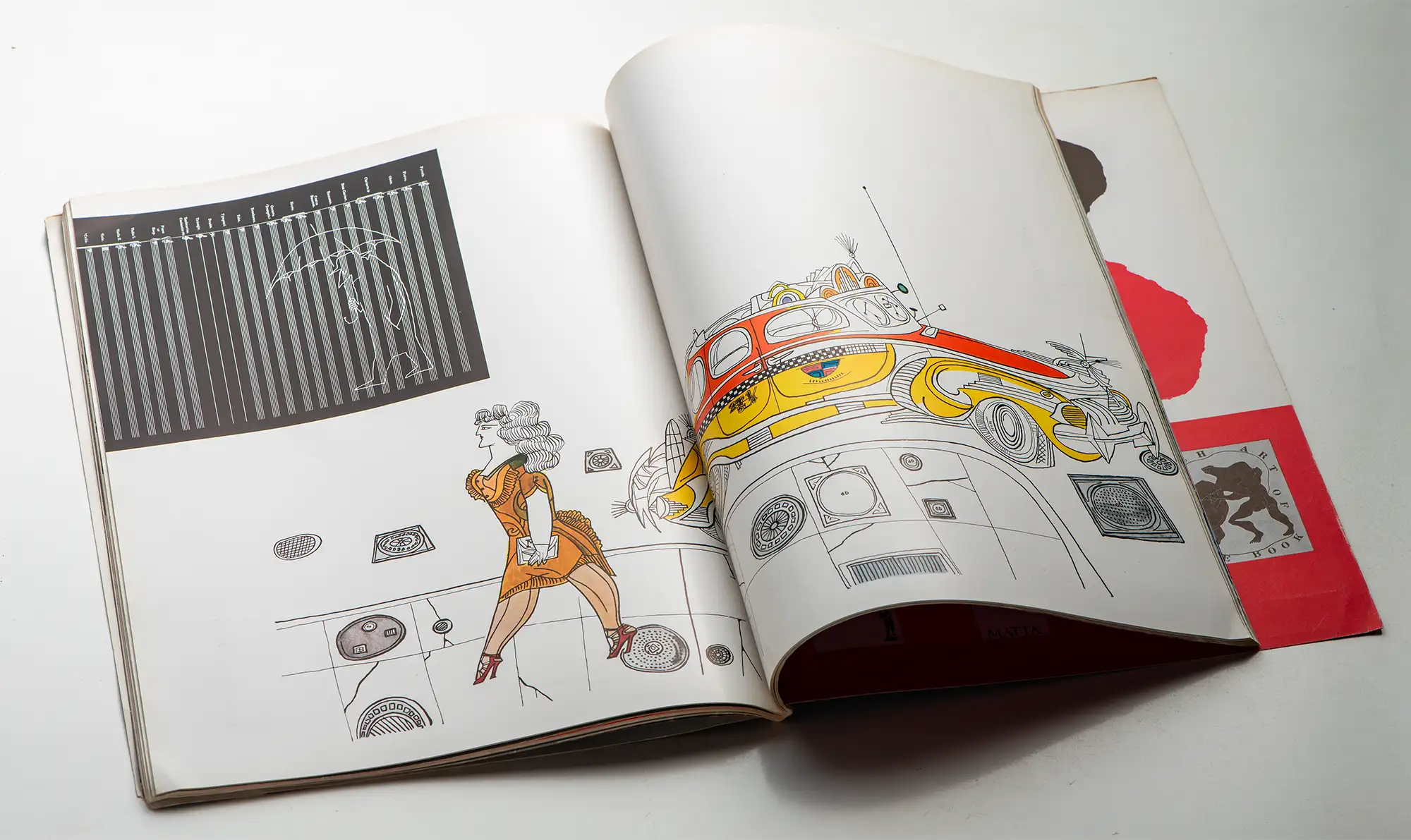
William Steig — Arrangements of disembodied heads.
Sleepwalker, Tough Guy, Huh, Argument, Courtesy, Hatred Portfolio 2, Summer 1950, Page 88-89.
Selected Contents from Portfolio No. 3 (Winter 1951)
The third and final issue of Portfolio was its most ambitious.
Published at a moment when the future of the magazine was already uncertain, Portfolio No. 3 appears unusually dense and expansive. The scope widens, the sequences lengthen, and the number of major contributors increases—suggesting an editorial urgency, as if Brodovitch were determined to push the experiment to its limits.
Rather than consolidating previous themes, the final issue intensifies them. Fine art, graphic experimentation, scientific vision, and calligraphic tradition coexist without hierarchy. The magazine becomes more inclusive and more radical at the same time, embracing complexity rather than resolution.
Seen in retrospect, Portfolio No. 3 reads less as a conclusion than as an open field—an unfinished manifesto for a new editorial language that would outlive the magazine itself.
This issue includes:
Ben Shahn — a comprehensive portfolio presenting the breadth of his graphic and pictorial work.
Calligraphy — the art of fine writing examined as a living visual discipline.
Stereography — the principles of binocular vision explored through experimental imagery.
- Jackson Pollock — an intimate portfolio, including close-up details of his paintings.
- Alexander Calder — an experimental portfolio emphasizing movement and structure.
- Robert Osborn — surrealistic cartoons combining satire and graphic invention.
Revealing the Hidden Architecture of Portfolio
The third and final issue of Portfolio was its most ambitious.
Portfolio was conceived as a magazine of sequences, rhythms, and visual continuities—but its physical construction worked against that ambition.
Like many mid-century publications, it was bound extremely tightly, using metal staples and heavy glue intended to guarantee durability rather than readability. As a result, the central areas of many double-page spreads were permanently obscured. Key elements of Brodovitch’s compositions—axes, alignments, transitions—were lost in the gutter, even to contemporary subscribers.
For decades, Portfolio was therefore known through fragments: isolated pages, cropped reproductions, or partial views that never fully conveyed the logic of its design.
Ikonographia presents, for the first time, complete double-page spreads reconstructed from carefully unbound originals. By separating the pages and digitally reassembling them with precision, the original visual structures are finally revealed as Brodovitch intended them to be seen.
This is not restoration in the nostalgic sense, nor reinterpretation. It is an act of disclosure: making visible what was always there, but physically inaccessible.
Seen in this form, Portfolio emerges not as a collection of iconic pages, but as a continuous editorial architecture—one whose internal coherence can only be understood when the spreads are read in full.
Original binding concealed the central gutter of many spreads.
These reproductions reveal the complete compositions for the first time, made visible through careful unbinding and full-spread digitization.
1950 — The Turning Point in Magazine Publishing
In 1950, two magazines briefly redefined what editorial publishing could be.
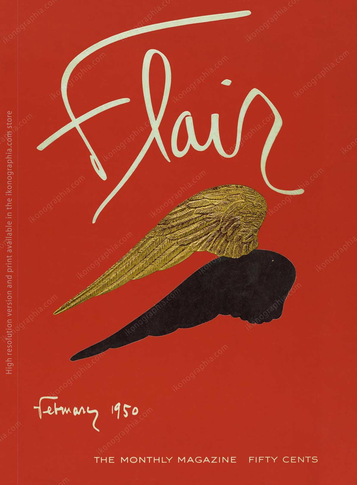
Portfolio, directed by Alexey Brodovitch, and Flair, created by Fleur Cowles, were conceived not as periodicals but as editorial experiments without precedent.
Both rejected conventional formats, budgetary restraint, and commercial compromise.
Both expanded the visual vocabulary of magazines beyond illustration and layout into sequencing, materiality, and authorship.
And both ceased publication after a single year—undone not by failure, but by the cost of radical ambition.
Their lifespan was brief. Their impact permanent.
What followed was not imitation, but a recalibration of what magazines could dare to be.


In 1950, Portfolio and Flair marked a turning point—proving that a magazine could be an authored work, not merely a container for content.
About Alexey Brodovitch. A short bio.

Brodovitch at work in his studio.
Alexey Brodovitch (1898–1971)
Alexey Brodovitch was a Russian-born American designer, photographer, editor, and teacher whose work fundamentally reshaped twentieth-century visual culture. Best known as the art director of Harper’s Bazaar (1934–1958) and the creator of Portfolio magazine, Brodovitch redefined the role of design as an active, expressive force rather than a neutral frame.
After leaving Russia, Brodovitch settled in Paris in 1920, where his formation was shaped by a uniquely dense artistic environment. He encountered avant-garde experiments emerging from Moscow, absorbed Bauhaus principles circulating from Germany, engaged with Italian Futurism, and studied the evolving languages of Cubism, Fauvism, Purism, and Surrealism. This plural exposure forged a visual sensibility grounded in movement, contrast, and disciplined freedom.
In the United States, Brodovitch became both a radical innovator and an influential educator. Through teaching and editorial work, he mentored generations of photographers and designers—including Richard Avedon, Irving Penn, Diane Arbus, and Garry Winogrand—establishing a legacy that continues to define modern editorial design.


