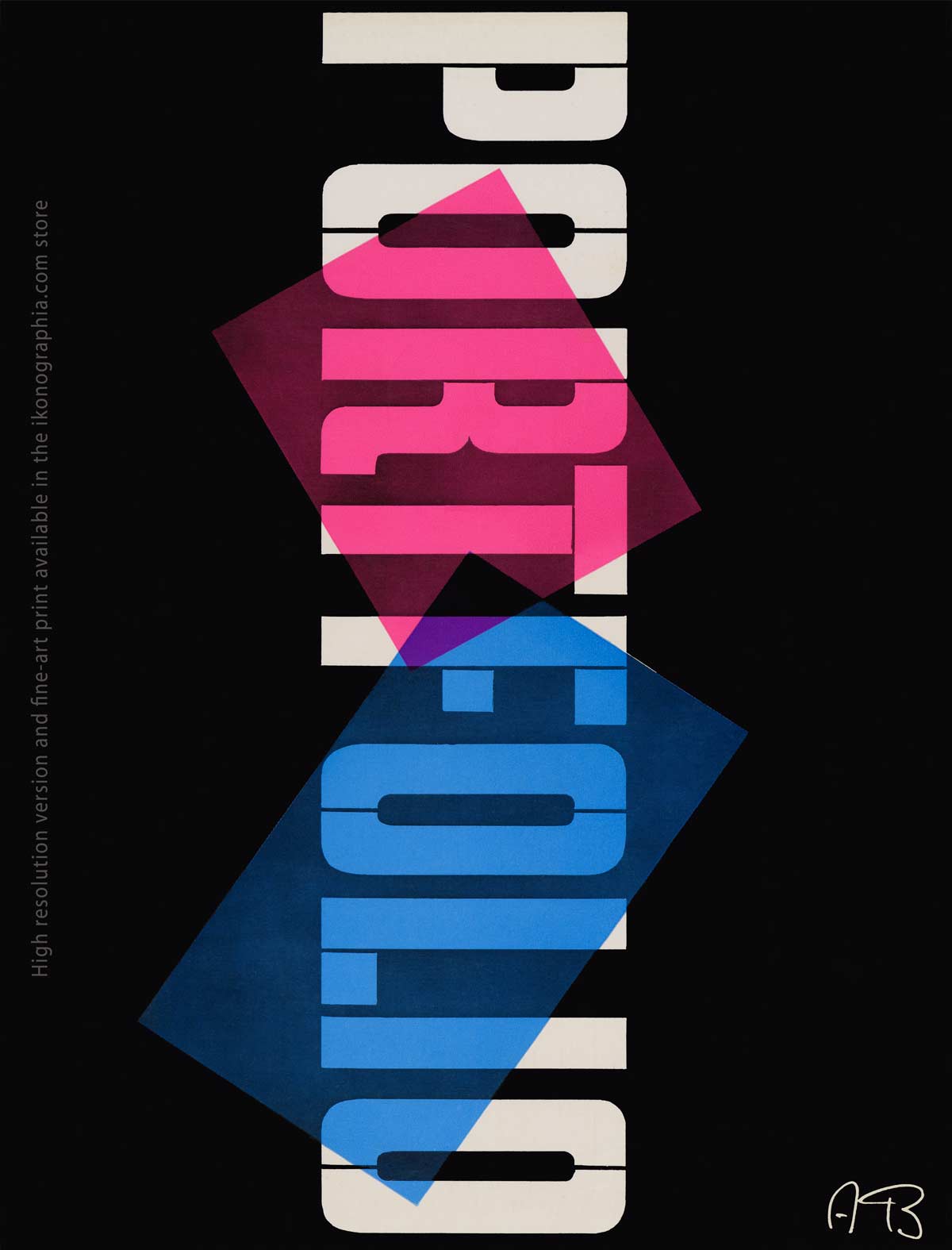
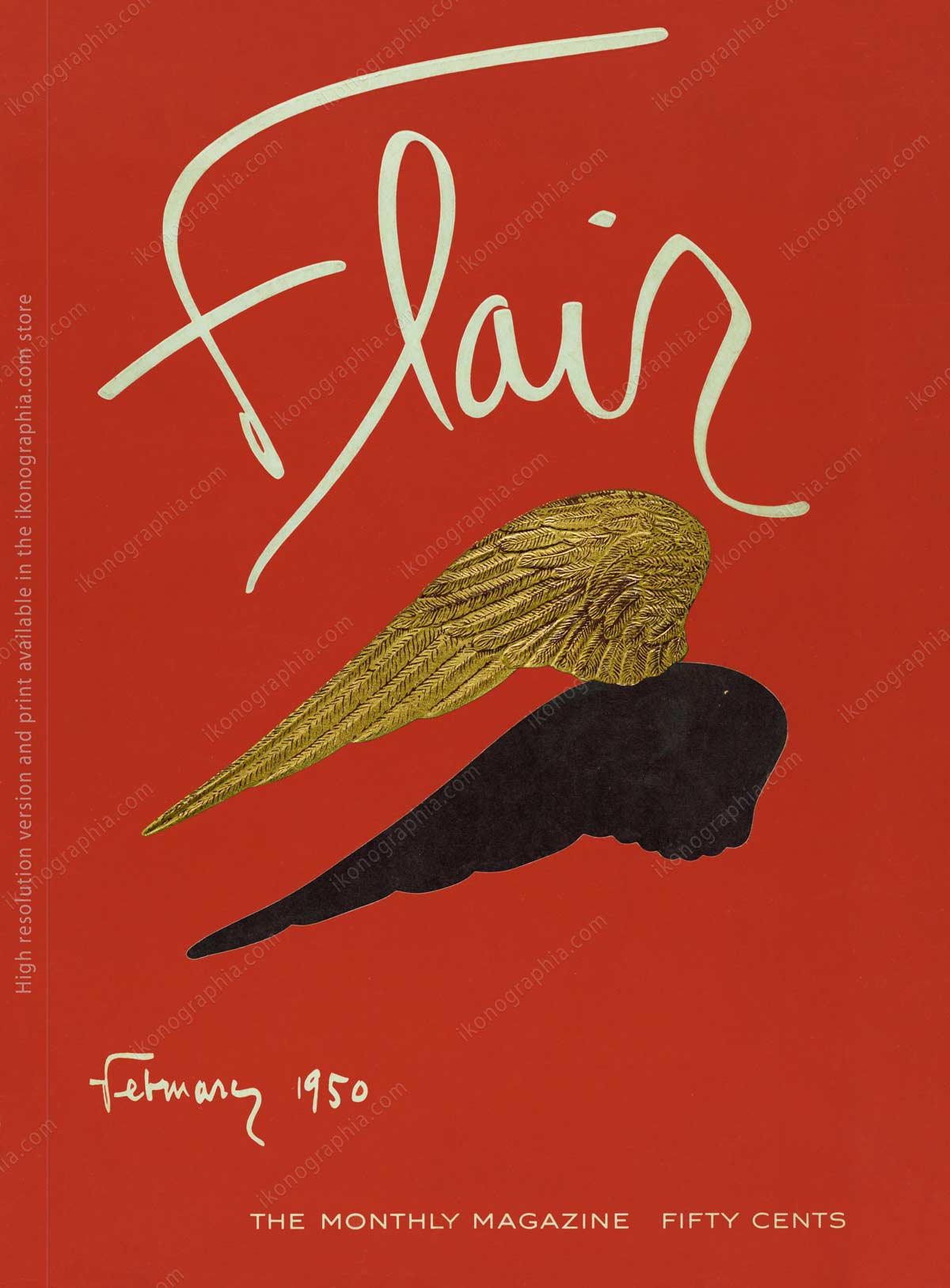
Portfolio Magazine by Brodovitch as never seen before. 1950
Portfolio, the definitive graphic design magazine of the twentieth century.
“Portfolio” by Alexey Brodovitch, published in the Winter of 1950, has been widely acknowledged as the definitive graphic design magazine of the twentieth century.
The idea for the publication came from art director Frank Zachary. He wanted a magazine focused solely on art and design. Brodovitch was intrigued by the concept. Although he enjoyed his work at Harper’s Bazaar, the space and subject matter limitations often cramped his creative style. Portfolio freed him from the practical and aesthetic restraints to which he had grown accustomed. The publication pages were space for his graphic imagination to run wild. This text, mostly taken from Wikipedia, presents a widely shared point of view.
However, in the fifteen years before Portfolio, Brodovitch, as Art Director of Harper’s Bazaar, revolutionized the magazine design concept with the unfailing elegance of his pages, combined with an element of innovation. For this reason, many others consider Harper’s Bazaar the pinnacle of his career as a designer.
It was decided that Portfolio would run without ads, freeing up more space for the overall design. However, the enormous costs of the publication and lack of advertising revenue soon killed the magazine. Only three numbers were issued; the last was in the Spring of 1951.
Curiously, the innovative Flair Magazine was also published in 1950; produced without budget limits, it also ceased publication after one year because the cost of production could not be supported in the long run.
The first issue of Portfolio Magazine, Winter 1950, and the first issue of Flair, February 1950.
Selected Contents from Portfolio N.1 – Design from Mathematicians
The insatiable curiosity, search for new forms of artistic expression, and freedom from the magazine’s format led Brodovitch to explore the most varied disciplines. Below is the series of pages designed in double spread with illustrations created by Mathematics, and the article’s original introduction.
Use arrows to broswe pages or tap on devices.
Mathematics, a philosopher once said, possesses not only truth but great beauty. Recently, a group of professional mathematicians have made their science the basis of a fascinating new kind of art. They are demonstrating that beautiful graphic designs can grow from a geometrical theorem. Their exhibit gallery is the Scripta Mathematica, an internationally famed quarterly published by Yeshiva University in New York under the editorship of Dr. Jekuthiel Ginsburg. The magazine’s erudite contributors regularly decorate its pages with curious forms and dynamic patterns resulting from complicated algebraic equations graphically projected into two dimensions. They offer exciting possibilities to the designer looking for fresh visual ideas.
Page 20-21. Left: The saddle-shaped form of a hyperbolic paraboloid. Above: An electron contour map of a molecule of phthalocyanine produces an interesting amoeba-like pattern.
Page 22-23. The beauty of geometrical forms is seen in these designs by Dr. Herman Baravalle, a mathematics professor at Adelphi College, Long Island. Left: The saddle-shaped form of a hyperbolic paraboloid.
Above: An electron contour map of a molecule of phthalocyanine produces an interesting amoeba-like pattern.
Page 24-25. Left page: a wave curve with black and white parallel lines. Upper left, straight lines tangent to a hyperbole combined with a circle. Right, wave curve.
Right page: upper left, a group of tangents to an astroid (star-shaped) curve. Upper right, catacaustic curve (reflected inside a cup) made with straight lines. Below is the design of the refraction of light.
Saul Steinberg drawings from his unpublished private sketchbooks.
Saul Steinberg, a Rumanian-born ex-architect, is one of the few U.S. cartoonists who also happens to be an artist at his work. When the Museum of Modern Art hung an exhibit of his drawings, one newspaper reviewer questioned the show with an article entitled “It’s Funny—But Is It Art”?
But Steinberg’s admirers seem to include most persons who have seen his drawings in The New Yorker, Harper’s Bazaar, Town and Country, and other magazines; this was like asking if Charlie Chaplin could be taken seriously as a social critic because he wears baggy pants and crooked shoes.
Steinberg is compared with Chaplin because although the mediums they operate are two different things—their comic technique springs from the same source. Steinberg eschews the written word as Chaplin eschews the spoken word and speaks only through the pantomime of his pen.
His strange, silent world is peopled with chinless, blank-faced men, beady-eyed women with monstrous headdresses, precocious animals, and weird architectural fantasies, all drawn in a thin, wiry line that often wanders into an embellishment of scrolls and flourishes as Steinberg pauses to extract the Freudian implications of a cluttered interior, the curl of a beard, or just a plain doodle. At other times, the economy of his line is amazing, as in his drawing of the little man walking against a rain of empty clefs on a music sheet. Reproduced here are eight pages of Steinberg drawings from his unpublished private sketchbooks. Excerpt from Portfolio 1, pages 84-85.
Eight pages of Steinberg drawings from his unpublished private sketchbooks.
Portfolio N.1, Winter 1950. Pages 84-91
Then browse the other three using the Previous-Next tab.
Xerography. New Visual Effects with Powder and Electricity.
In his never-ending search for new ways of presenting the too-familiar, the experimental graphic artist has been given a new tool from an unexpected quarter—the electronics laboratory.
Recently, the Battelle Memorial Institute of Columbus, Ohio, an organization dealing in basic scientific research, began inviting selected representatives of the photographic world to a series of demonstrations of a new reproduction medium of their development, which they called Xerography, the first revolutionary development in rendering a photographic image since Daguerre coated his first plate 110 years earlier. It substitutes an electrically charged plate for the film now in use.
The Battelle demonstrator placed an ordinary plate holder into the back of a view camera. He made his exposure and disappeared with his holder into the darkroom. The onlookers settled down for a thirty-minute wait, but after one minute, the demonstrator returned, waving a dry, finished print.
Pages 42-43. Four xerographic studies of a water goblet show the various effects possible with the process. Graphic Design by Alexey Brodovitch.
Pages 44-45. This mysterious portrait resulted when the electrical charge on the xeroplate broke down.
The Bodoni Typeface.
Alexey Brodovitch was a big fan of Bodoni’s work. The Bodoni typeface was widely used in Portfolio.
The first editorial content in the first number of Portfolio was, of course, on Gian Battista Bodoni, “an Italian genius who created the Bodoni, America’s most widely used typeface.” Excerpt from the original article’s text.
One day in 1787, in his printing shop in Philadelphia, Benjamin Franklin received a specimen sheet of typefaces from Giambattista Bodoni of Parma, Italy. This was the first time that Franklin had seen the work of the man considered Europe’s foremost type designer and printer, and he was greatly impressed.
“I have had the great pleasure of receiving and perusing your excellent “Essai des Characteres de L’Imprimere,” he wrote Bodoni. It is one of the most beautiful that Art has hitherto produced. As the first American to go on record in appreciation of the Bodoni typeface, sage old Ben Franklin pioneered a trend in U. S. typography, which was to have far-reaching effect on the design of printed matter in our time.
Portfolio 1. Pages 4-5. Before Giambattista Bodoni, roman letters had the form of the old-style A (opposite) with heavy stems and curving serifs, as in hand-writing. This sheet (right) from Bodoni’s Manuale Tipografica shows how he altered the design of printing types to give them a mechanical appearance. He emphasized the contrast between light and heavy strokes, with serifs forming sharp right angles with the upright strokes, producing the first modern typeface.
Pages 12-13. Beautiful classic borders and decorations in Bodoni Style.
Pages 14-15. Left: Arabic Numerals from Bodoni’s “Manuale Tipografica.” Right: A reprint-as-the-original of Bodoni’s Q. Horatii Flacci Opera 1791 (Horace’s Opera.) This insert reproduces four specimen pages from books designed by Giambattista Bodoni in 18th Century Parma.
A Typeface designed by Alexey Brodovitch. The Albro Alphabet (after the first syllables of his name) was inspired by the signs and symbols of musical notation. It was released through Photo-Lettering, Inc., New York.
Copyright, links and credits
Works published in the United States from 1928 to 1963 fell into the Public Domain if the copyright was not renewed with the Copyright Office during the 28th year after publication. The Portfolio Magazine copyright was not renewed.
Read more on “United States. The Copyright Renewal Nightmare.”
Links:
Alexey Brodovitch, Wikipedia
Portfolio. A Magazine For The Graphic Arts
Alexey Brodovitch. The genius of editorial design

Alexey Brodovitch at work, 1950.
Source: Wikipedia
Alexey Brodovitch (1898 – 1971) was a Russian-born American photographer, designer, and instructor most famous for his art direction of the fashion magazine Harper's Bazaar from 1934 to 1958 and the iconic Portfolio Magazine.
In 1920, he moved to Paris, exposed to everything from Dadaism, Suprematism, and Constructivism from Moscow, Bauhaus design from Germany, Futurism from Italy, and the native strains of Cubism, Fauvism, Purism, and Surrealism. Among these various artistic influences, Brodovitch found his beginnings as a designer. He produced posters, china, jewelry, textiles, and advertisements.
In 1930, he moved to the U.S., teaching advanced students and experimenting with all design aspects. Among them are Diane Arbus, Eve Arnold, Richard Avedon, Hiro, Lisette Model, Garry Winogrand, Irving Penn, and Joel Meyerowitz.
In 1934, Carmel Snow, the editor-in-chief of Harper's Bazaar, hired him as Art Director of Harper's Bazaar, where he radically changed the fashion magazine's design.
In 1950, Brodovitch launched the revolutionary publication Portfolio, widely acknowledged as the definitive graphic design magazine of the twentieth century, focused solely on art and design. It was simultaneously an outstanding example of design itself.


